Introduction to height transition in CSS
The current best approch in term of height transition, is using the grid transitions. But other cool solutions exists or will be existing in the future.
In this article, I’ll show you five ways to transition an element’s height. We’ll start with older, less reliable methods and move on to modern techniques that work best.
All the examples I provide below are interactive, so feel free to experiment with them!
Common height transitions
We’ve all wanted to transition an element’s height directly. Unfortunately, it’s not that simple.
If you know the final height and set it as a static value, it works perfectly. But in most cases, the element’s height is dynamic and unpredictable.
Here is the HTML:
<button>Toggle dropdown</button>

<div class="dropdown hide">
  <div>Some content</div>
</div>
Here is the CSS:
.dropdown {
  overflow: hidden;
  height: 210px; /* example 1 */
  height: auto; /* example 2 */
  transition: height 0.5s ease;
}

.hide {
  height: 0px;
}
Then I toggle the .hide class with some JS by clicking on the button.
On the demo below you can see:
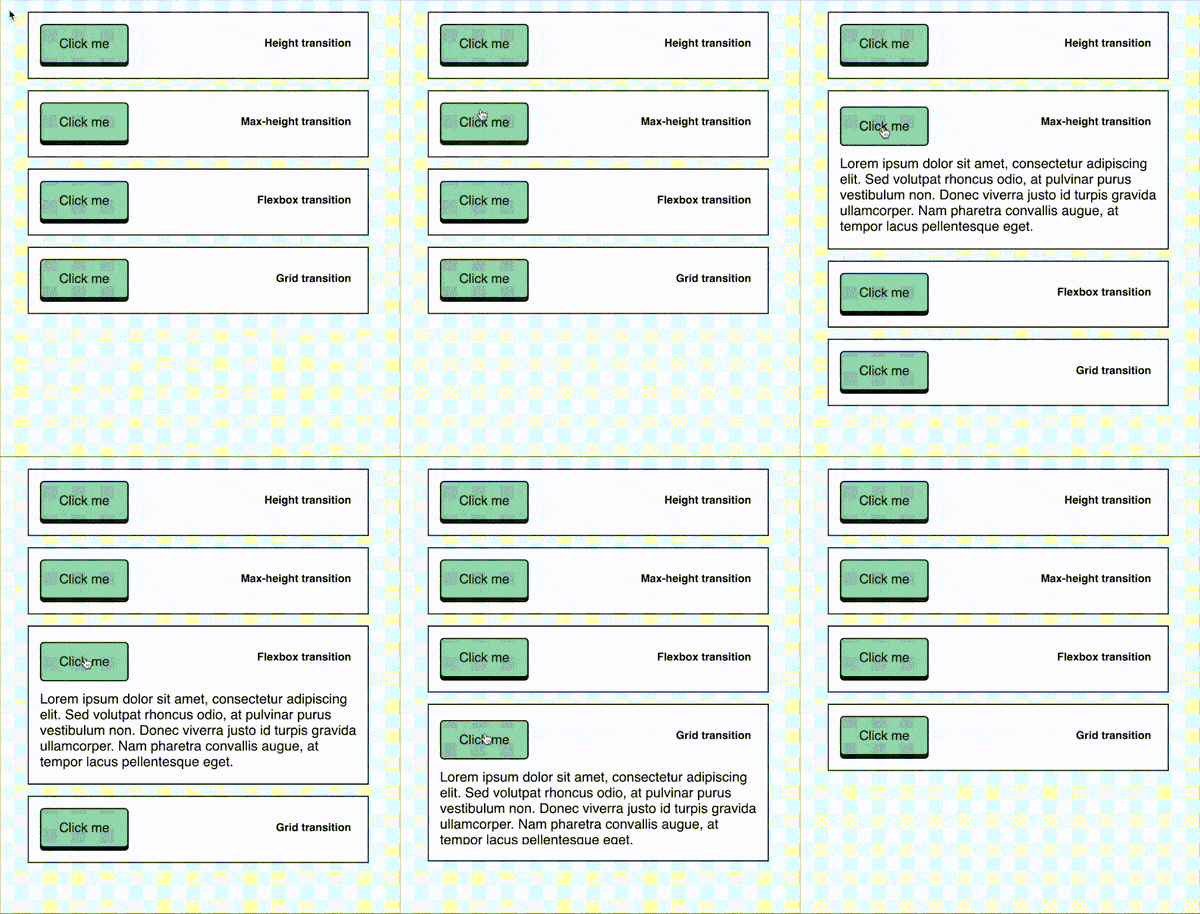
- For the first one, the animation works because there is an explicit height.
- For the second one, there are no animation because the height is set to auto.
Transitioning the max-height in CSS
Since transitioning height directly doesn’t work well, what about using max-height?
Sadly, like the height value, you can’t directly animate it’s height to an auto value.
This approach is still a bit better since you can set a larger value, and the animation will work. However, if the value is too high, the transition speeds up too quickly and becomes erratic.
Here is the CSS:
.dropdown {
  overflow: hidden;
  max-height: 100px; /* | 400px | 1000px */
  transition: height 0.5s ease;
}

.hide {
  max-height: 0px;
}
Try toggling the content by clicking the button and changing the max-height values:
max-height property: You see that if the max-height has a value too big, the animation is too quick and delayed.
And if the value is too low, the text will be cropped.
Height transition with flex
The previous examples aren’t ideal, as they come with many limitations.
But did you know you can transition the height to 100% using flex?
The HTML structure changes a bit (there is one more div inside the dropdown):
<button>Toggle dropdown</button>

<div class="dropdown hide">
  <div>
    <div class="inner">Some content</div>
  </div>
</div>
And the CSS looks like that:
.dropdown {
  display: flex;
}

.inner {
  max-height: 0;
  overflow: hidden;
  transition: max-height 0.5s linear;
}

.dropdown:not(.hide) .inner {
  max-height: 100%;
}
See the example below:
It works, but there are still two issues:
- You need to add a wrapper div for it to function properly
- While the content transitions, its container expands instantly
Want to build modern interfaces with less JavaScript?
I wrote a guide about building modern UI with HTML and CSS first. It covers practical patterns you can use before reaching for JavaScript.
Learn moreHeight transition with grid
Another more flexible solution is using CSS Grid. Similar to the flex approach, Grid can help us transition an element’s height, but with better control and fewer limitations.
In this case, we’ll utilize the grid-template-rows property to animate the height.
Here’s the updated HTML:
<button>Toggle dropdown</button>

<div class="dropdown hide">
  <div class="inner">Some content</div>
</div>
And the CSS:
.dropdown {
  grid-template-rows: 0fr;
  transition: grid-template-rows 0.5s ease;
  display: grid;
}

.inner {
  overflow: hidden;
}

.dropdown:not(.hide) {
  grid-template-rows: 1fr !important;
}
In this example:
grid-template-rows: 0frhides the content, while1frmakes the content fully visible.- The height smoothly transitions as the grid adjusts.
With Grid, there’s no need for extra wrapper divs, and the container height adjusts smoothly along with its content. It also gives you finer control over the layout compared to flexbox.
New height transitions in the future?
One promising feature is the upcoming calc-size() function, which will bring even more flexibility to CSS layouts.
What this function does is convert values like auto to specific pixel values which it can then use in calculations with other values. This is handy on its own, but where it is most useful is with animating elements that are auto sized.
Here is what it looks like:
.dropdown {
  height: 0;
  overflow: hidden;
  transition: height 0.3s;
}

.dropdown:not(.hide) {
  height: calc-size(auto);
}
The support is almost inexistant as today, but I believe it will spread soon to all major browsers!
Support My Work
Feel free to leave your comments or questions by email at hey@theosoti.com.
If you found this article helpful, please share it with your peers and join my newsletter below for more web development tutorials.
Happy coding!
