Custom Border Animations
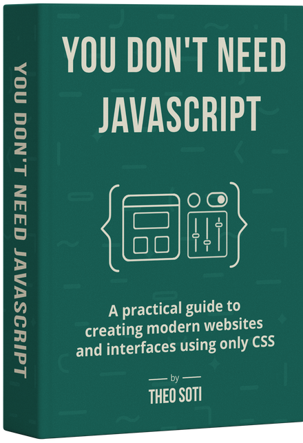
This article is adapted from a chapter of my book, You Don’t Need JavaScript.
Animated borders used to require heavy tricks: JavaScript continuously redrawing gradients, or SVG filters layered behind content. Today, modern CSS gives us all the ingredients natively. With a pseudo-element, a conic gradient, and the new @property rule, we can create glowing, rotating borders that feel alive.

The Basic HTML Structure
The markup is minimal:
<div class="card">
	<!-- Your card content goes here -->
</div>
The work all happens in CSS.
Preparing the card
The card needs to establish itself as a positioning context so that its pseudo-elements can sit exactly behind it. It also needs a solid background to prevent the animated gradient from leaking through.
.card {
	position: relative;
	z-index: 1; /* keep content above the border */
	background-color: white; /* hides gradient behind the face */
}
Without the background color, the gradient layer we’ll add would bleed through, competing with the card’s content.

Adding a border layer
We create the “border” not with border itself, but with a pseudo-element stretched slightly larger than the card.
.card::after {
	content: '';
	position: absolute;
	inset: -4px; /* expand 4px beyond every edge */
	z-index: -1; /* push it behind the card */
	border-radius: inherit;
}
The negative inset makes the pseudo-element stick out beyond the card, visually becoming its border. Inheriting the radius ensures corners line up perfectly.
Declaring an animatable property
We want this border to rotate smoothly. To do that, we need a custom property for the angle — but not all custom properties can animate by default. The @property at-rule tells the browser that —angle should behave like a real angle value, so it can be interpolated in keyframes.
@property --angle {
	syntax: '<angle>';
	initial-value: 0deg;
	inherits: false;
}
This registers —angle as an angle type, starting at 0deg. The inherits: false ensures each card manages its own angle, rather than inheriting from a parent.
Drawing the gradient
Now we paint the border using a conic gradient that rotates based on —angle:
.card::after {
	/* ...previous declarations... */
	background: conic-gradient(
		from var(--angle),
		#ff4545,
		#00ff99,
		#006aff,
		#ff0095,
		#ff4545 /* repeat first stop for a seamless loop */
	);
}
The repeating first color stop avoids a visible jump where the gradient loops. Even without animation, this already produces a colorful border.

Animating the spin
To bring it to life, animate —angle from 0 to 360 degrees in an infinite loop:
.card::after {
	/* ...previous declarations... */
	animation: spin 3s linear infinite;
}

@keyframes spin {
	to {
		--angle: 360deg;
	}
}
Want to build modern interfaces with less JavaScript?
I wrote a guide about building modern UI with HTML and CSS first. It covers practical patterns you can use before reaching for JavaScript.
Learn moreAdding the glow
The border already rotates, but we can make it feel more alive by giving it a soft halo. We do this by duplicating the gradient in another pseudo-element and applying blur.
/* Shared border setup for both layers */
.card::after,
.card::before {
	content: '';
	position: absolute;
	inset: -4px;
	z-index: -1;
	border-radius: inherit;
	background: conic-gradient(from var(--angle), #ff4545, #00ff99, #006aff, #ff0095, #ff4545);
	animation: spin 3s linear infinite;
}

/* Blur and fade the ::before layer for a glow effect */
.card::before {
	filter: blur(1.5rem);
	opacity: 0.8;
}
Here’s what’s happening in layers:
The ::after pseudo-element is our crisp, sharp border.
The ::before pseudo-element is the exact same gradient, but blurred and semi-transparent. The blur makes the bright colors spill outward beyond the edge, softening into a glow.
Because both are positioned in the same place, the sharp version sits on top and the blurred version radiates beneath it.
Together, they produce the illusion of a glowing border without any extra graphics or images.
Respecting reduced motion
Animations should never be forced on users who prefer static interfaces. We can turn the spin off gracefully with a media query:
@media (prefers-reduced-motion: reduce) {
	.card::after {
		animation: none;
	}
}
This leaves a colorful static border for users who opt out of motion.
Final thoughts
With modern CSS, custom border animations no longer need JavaScript workarounds or SVG tricks. A pseudo-element, a conic gradient, and @property are enough to create a border that feels polished, animated, and surprisingly lightweight.
Like any strong visual effect, it works best when used with intention. Keep it for featured surfaces, and keep the reduced-motion fallback in place so the effect stays decorative rather than distracting.
You can check a codepen here: https://codepen.io/editor/theosoti/pen/019d123a-1628-7b30-967f-8ce6e24ddd87.
Or you can check out a live example on my landing page: https://theosoti.com/you-dont-need-js/.
Support My Work
Feel free to leave your comments or questions by email at hey@theosoti.com.
If you found this article helpful, please share it with your peers and join my newsletter below for more web development tutorials.
Happy coding!