Introduction
When I started working on the cover for my book You Don’t Need JavaScript, I thought it would be quick. Turns out, I went through a few different experiments before getting something that actually felt right.
Design is rarely linear. It’s more like a loop of small tests, tweaks, and re-thinking. This cover was exactly that kind of loop: a mix of experiments, quick wins, and a few dead ends that eventually shaped the final look.
Trying with ChatGPT
My first idea was to let ChatGPT generate the cover for me. It was a fun starting point. I described the kind of layout I wanted, the vibe, the green color, and the typography direction. It produced some nice compositions at first glance, especially for the shapes and framing.
But it really struggled with text and positioning. The titles came out fuzzy, the fonts weren’t consistent, and sometimes letters would morph or overlap. It was clear that AI image generation still has a hard time with precise typography and visual hierarchy.
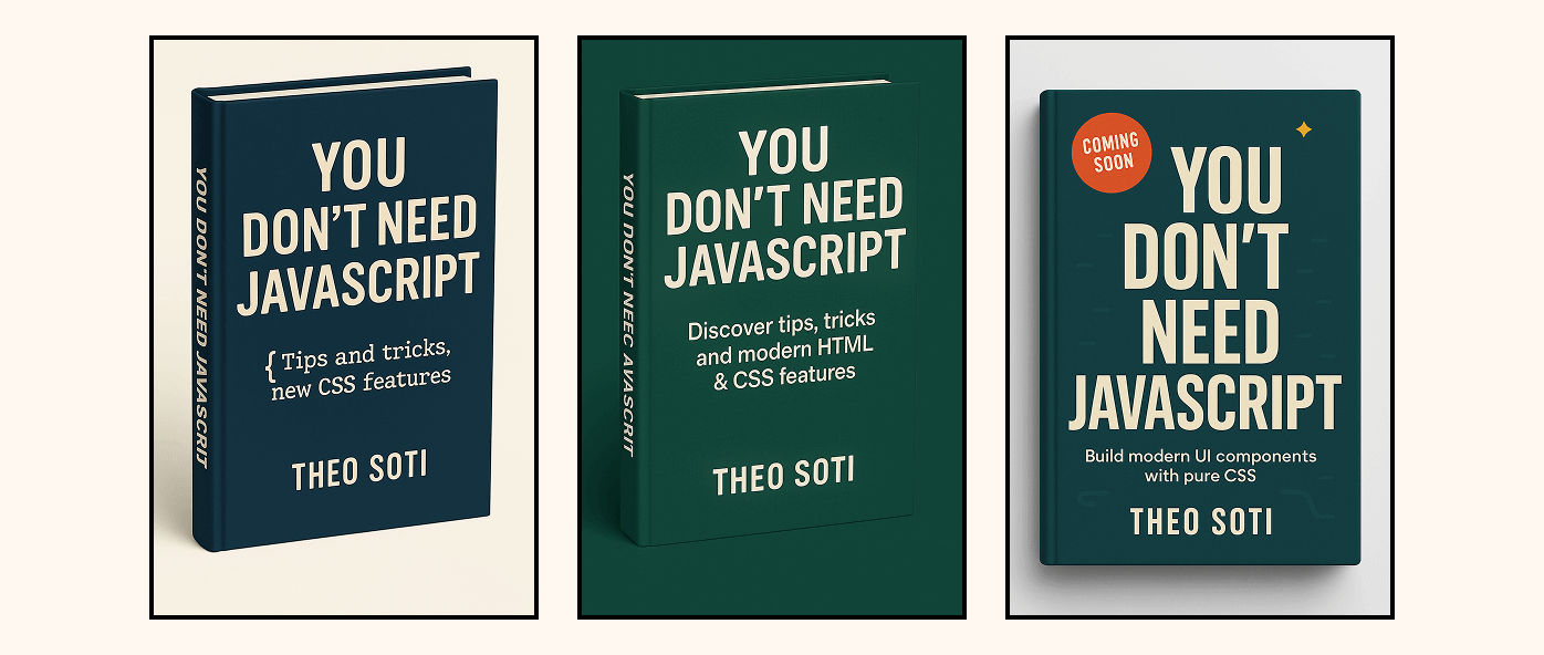
So instead of relying on it for the final image, I decided to use it more like a brainstorming partner. It gave me a few directions, but I knew I’d need to design the real thing by hand.
Starting Fresh in Photopea
With that in mind, I opened Photopea, my favorite free Photoshop alternative. It is online and does almost everything I need for design.
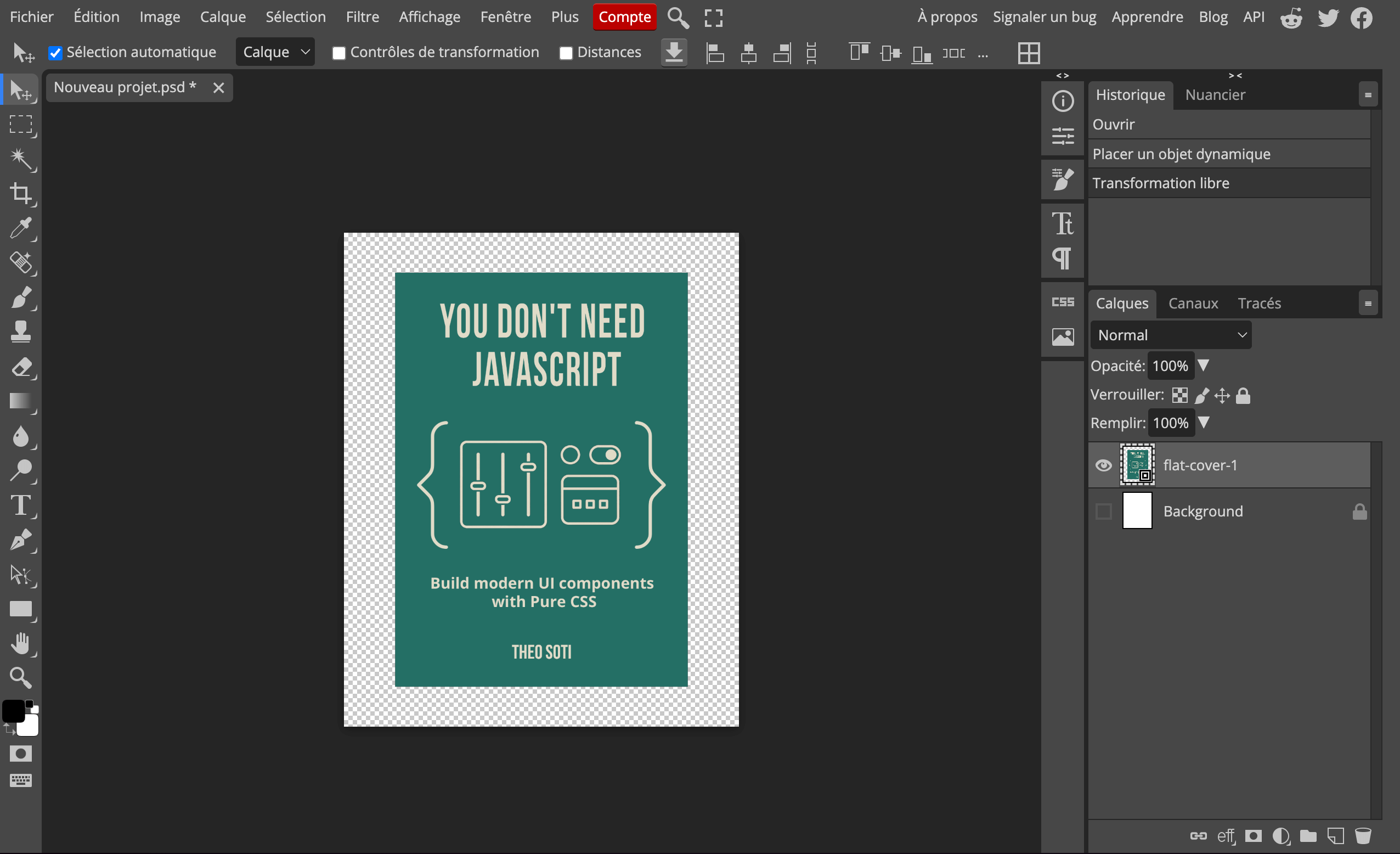
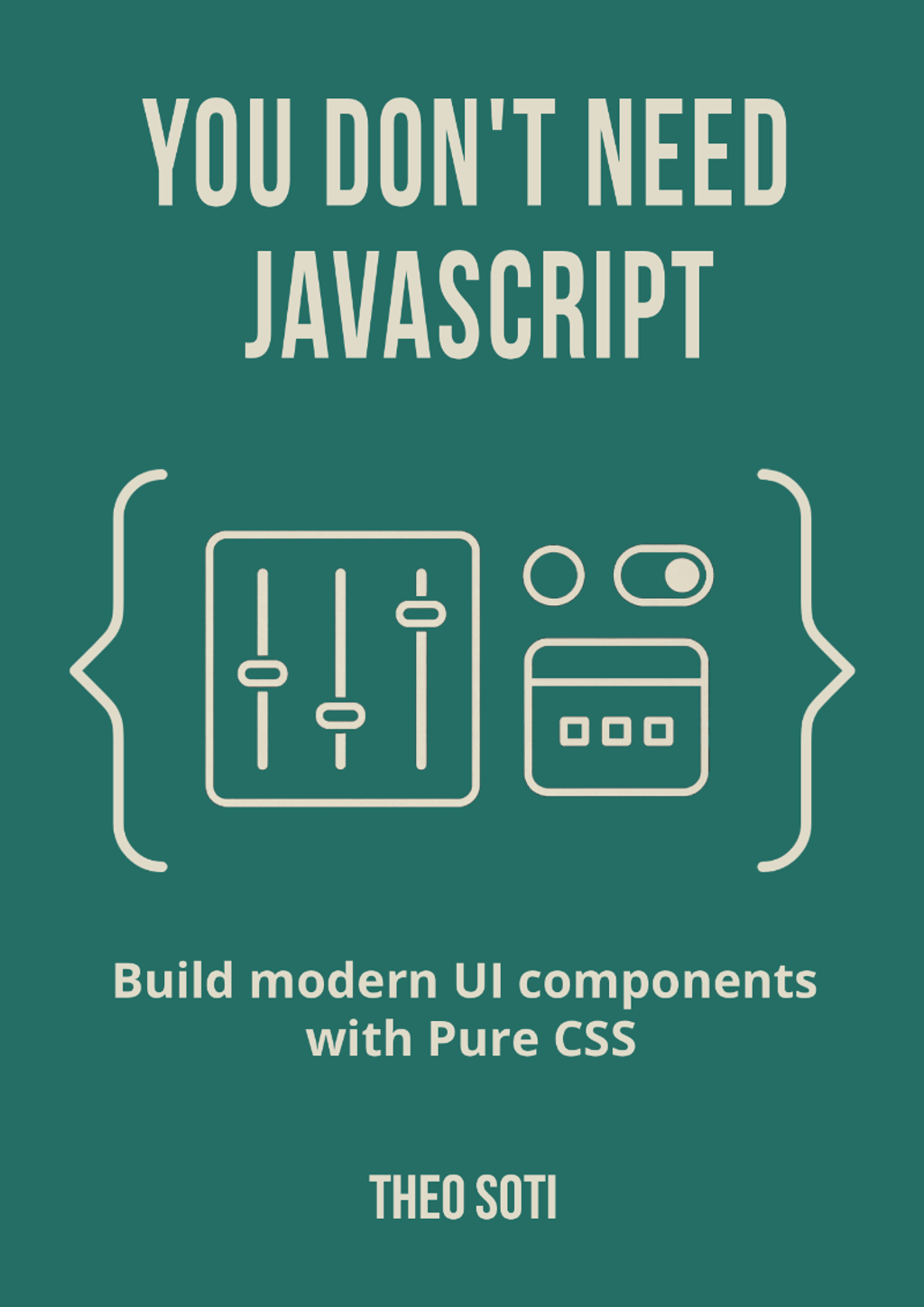
I started with a blank canvas. No mockup, no 3D, just the flat cover. That way, I could focus purely on the basics: layout, typography, and color.
I reused the green from my blog, but made it a bit deeper. For the text, I picked an off-white instead of pure white. It felt calmer and softer on the eyes. Then I chose a clean sans-serif font and started playing with letter spacing and sizing until it felt balanced.
I also worked on the central illustration. I had asked ChatGPT to generate a few icon ideas: panels, sliders, and simple shapes that would hint at user interfaces and CSS. One of those sketches had the right vibe, so I redrew and simplified it by hand. The result looked technical but friendly, which fit the ebook perfectly.
The first version looked okay, but it was missing something. Flat colors and clean typography alone made it feel a bit too sterile.
Creating the Background Pattern
To bring some life into it, I decided to create a subtle background pattern. Again, I started with ChatGPT to generate a base texture: small geometric shapes and lines that echoed a “code-like” rhythm.
After exporting the pattern, I edited it manually in Photopea. I simplified the shapes, adjusted spacing, and reduced opacity until it was barely visible. The idea was to make it something you feel rather than see, a quiet layer that gives the cover depth without distracting from the text.
That small detail made a huge difference. It suddenly looked less flat, more tangible, and more polished. For the first time, I felt like I was getting close.

Getting Feedback
Once I was happy with this new version, I sent it to a friend for feedback. He is honest and has a good eye, which is exactly what you need at that stage.
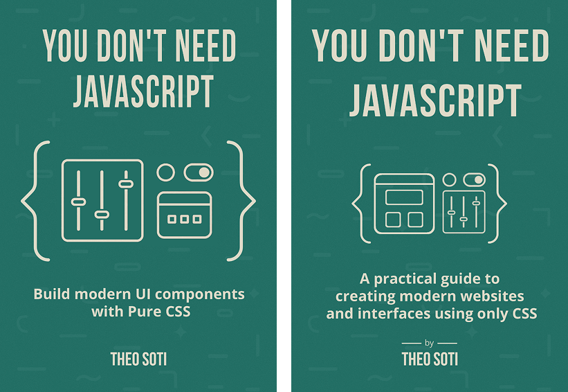
He pointed out a few things I had not noticed:
- The letter spacing in the title was a bit too tight
- The illustration was oversized
- One of the icons in the illustration wasn’t representing the theme of the book well
- The subtitle could be more clear and impactful
- Delimitating my name from the subtitle
All small things, but he was right about all of them.
It was subtle tweaks, but the difference was obvious when comparing both versions side by side.
That feedback round really helped. When you work on something for too long, you stop seeing it clearly. Having a fresh set of eyes was what made it finally click.
Wrapping It in a Mockup
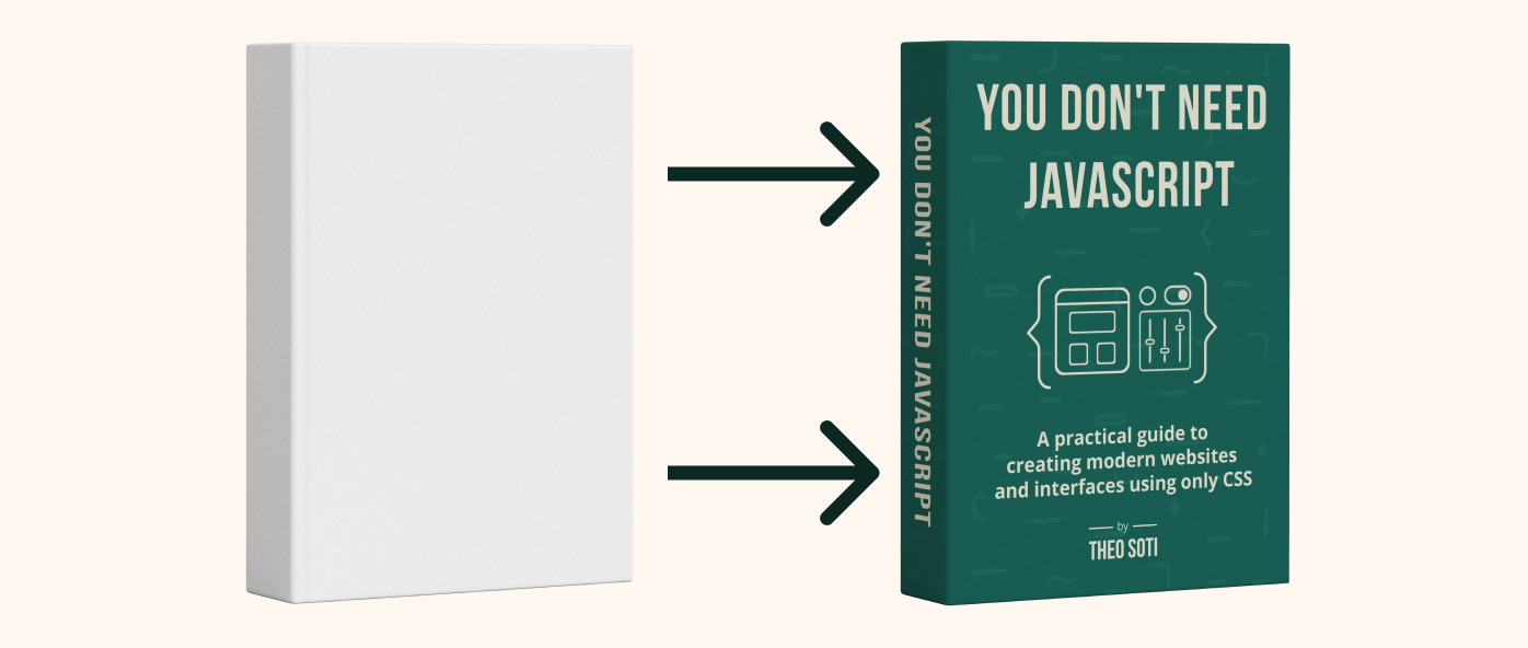
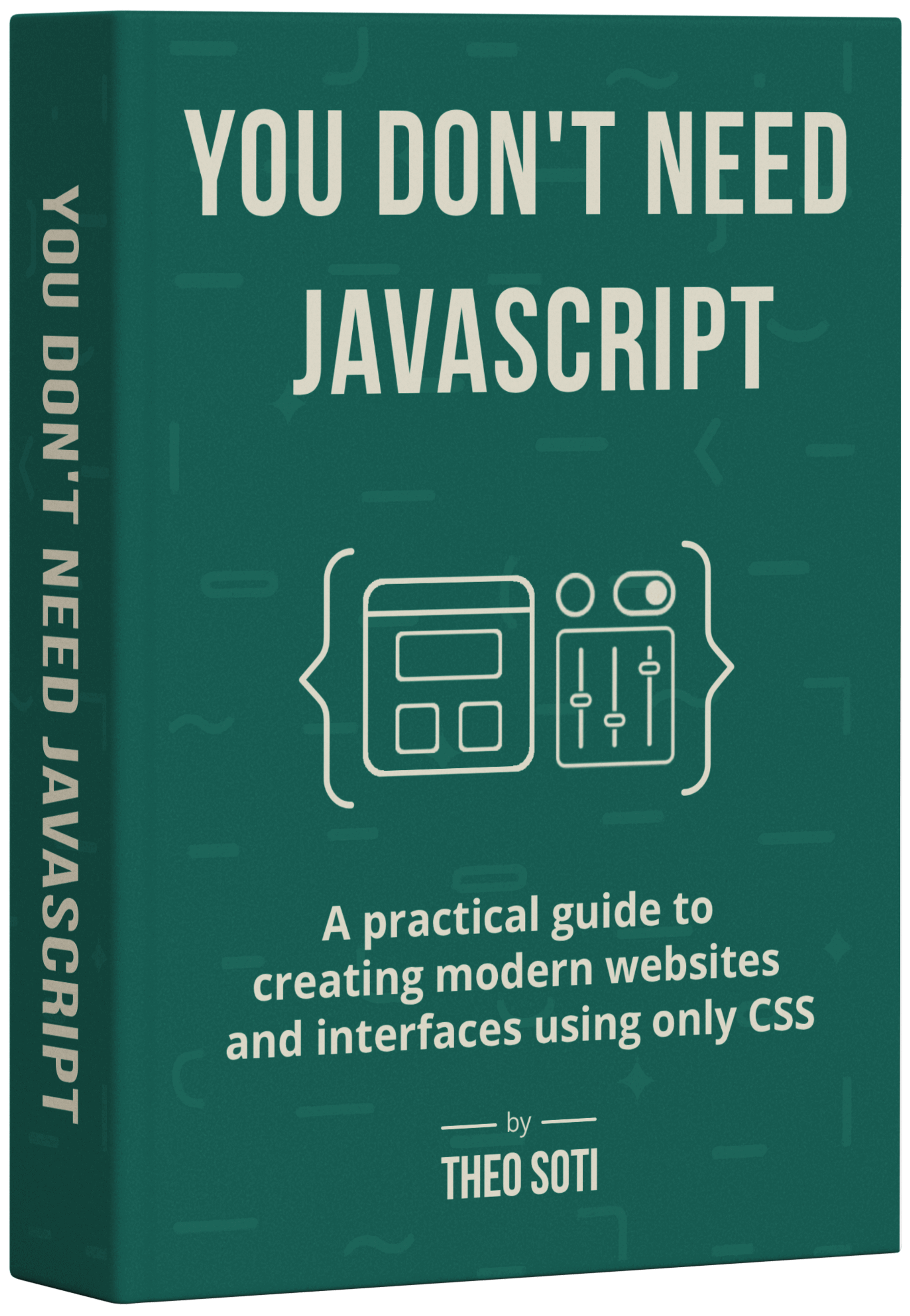
Once the design felt right, I wanted to see it in context, as an actual book.
So I found a mockup on mockups-design.com, a clean .psd file with nice perspective and lighting.
I opened it in Photopea again, and that is when I really started to appreciate smart objects. You can double-click the placeholder, paste your flat design, save it, and the mockup automatically updates in 3D. It is a small thing, but it feels like magic every time.
The first time I saw my flat design wrapped around that 3D book, I smiled. All the small iterations, the adjustments, and the feedback suddenly came together. It looked real, and more importantly, it looked like something I had made.
Final Thoughts
Designing this cover took way longer than I expected. I probably spent three or four evenings on it, tweaking, testing, and overthinking. But that process made it better. Each version taught me something new about simplicity, balance, and restraint.
The funny part is that it follows the same philosophy as the ebook itself. You do not always need the biggest tools or the fanciest effects, just clear thinking, good structure, and a few smart iterations.
I am really happy with how it turned out. It feels connected to my blog, consistent with my work, and simple enough to let the content speak first.
If you have not seen it yet, You Don’t Need JavaScript is available. It is a practical guide to building modern interfaces using only CSS.
Support My Work
Feel free to leave your comments or questions by email at hey@theosoti.com.
If you found this article helpful, please share it with your peers and join my newsletter below for more web development tutorials.
Happy coding!
