The next step in responsive design: container queries.

For many years, responsive web design relied on media queries. You define some parameters, and the layout changes depending on the screen size. Ideal for adapting designs for phones, tablets, and desktops. But what if your components need to adapt to the real space they are in, rather than just the screen size?
Enter container queries: a CSS feature that lets you style components based on the size of their parent container. It’s great for creating reusable, adaptable layouts that work seamlessly across different parts of a page.
For example:
- A Card component might look great in a wide sidebar but needs adjustments for a narrower one.
- A Profile block might stack its elements vertically in a small space but align them horizontally when there’s more room.
With container queries, your components don’t need to care about the entire screen anymore. They just care about their own box.
How do container queries work?
To use container queries, the first step is to tell CSS which parent element should act as a “container.” You do this with the container-type property. Here’s an example:
/* Define a container */
.parent {
  container-type: inline-size;
}
What this does is let the .parent element report its inline size (basically, its width) to its child elements. Once that’s set up, you can use the @container rule inside any child elements to adjust their styles dynamically.
.child {
  /* Default styles go here */
}

@container (min-width: 40rem) {
  .child {
    /* Apply these styles when the container's width is at least 40rem */
  }
}
It’s kind of like saying, “Hey, if my box is big enough, let’s give this component a different look.”
Real-world example
Imagine you’ve got a ProfileCard component, and it needs to display a profile picture, username, and bio.
In a small container, you might want to stack everything inside the card:
But in a larger container, you’d want a more horizontal layout inside the card:
Here’s the html I used for the card:
<section class="container">
  <div class="card">
    <div class="card__avatar">
      <img src="..." alt="Avatar" width="120" height="120" />
    </div>
    <div class="card__info">...</div>
    <div class="card__actions">...</div>
  </div>
</section>
With container queries, you can define a flexible design for this. Just mark the ProfileCard’s parent as a container, and then tweak the layout using something like this:
.card {
  display: grid;
  grid-template-columns: 1fr;
  grid-template-areas:
    'avatar'
    'infos'
    'actions';
}
.card__avatar {
  grid-area: avatar;
}
.card__info {
  grid-area: infos;
}
.card__actions {
  grid-area: actions;
}

@container (min-width: 18rem) {
  .card {
    grid-template-columns: 120px 1fr;
    grid-template-areas:
      'avatar infos'
      'actions actions';
  }
}
Try removing and adding cards to see how the layout changes. The card will adapt to the size of its parent container, making it a lot more flexible and reusable.
See how that works? The layout adjusts automatically depending on the space the component has to work with.
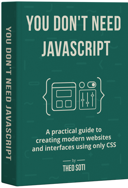
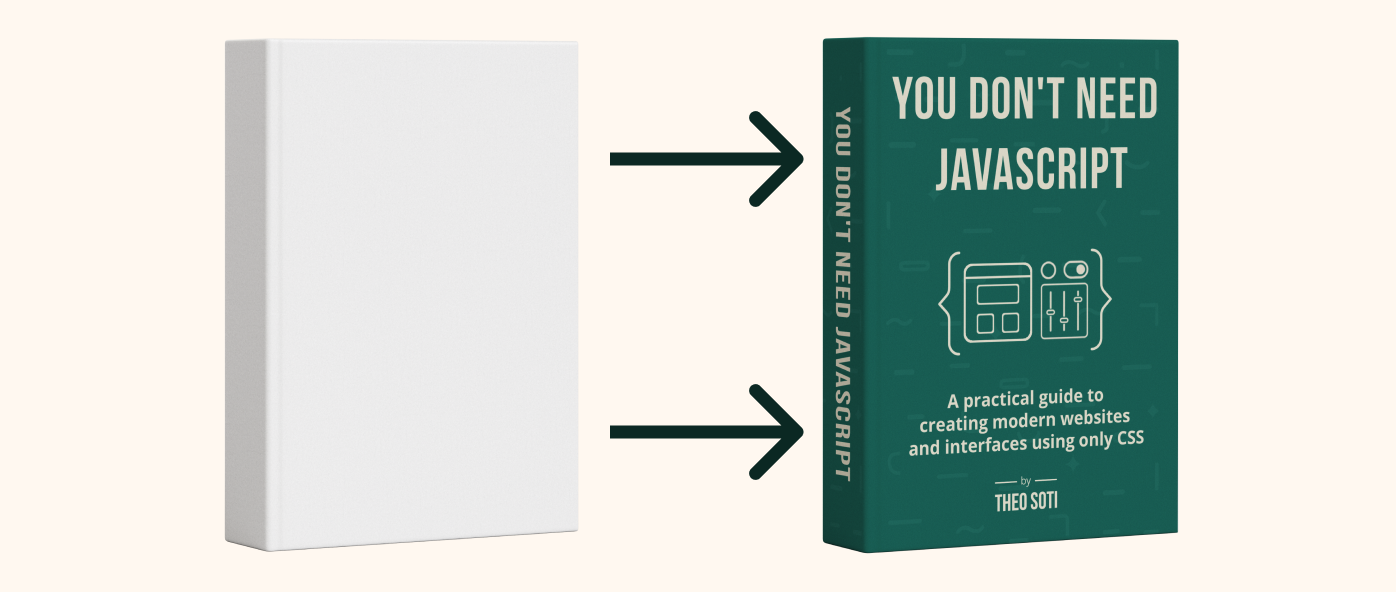
Want to build modern interfaces with less JavaScript?
I wrote a guide about building modern UI with HTML and CSS first. It covers practical patterns you can use before reaching for JavaScript.
Learn moreNaming containers
By default, container queries target the nearest parent with a container-type set. But what if a component is nested inside multiple containers, and you want to target a specific one? That’s where container names come in.
You can give a container a custom name using the container-name property. Then, when writing your @container rules, you can refer directly to that name.
Here’s how it works:
.sidebar {
  container-type: inline-size;
  container-name: sidebar;
}
Now that this container is named, you can write a query like this:
@container sidebar (min-width: 30rem) {
  .widget {
    /* Styles specific to when the sidebar is wide enough */
  }
}
This is super helpful when your layout has multiple containers, like a card inside a sidebar inside a grid. Instead of relying on CSS to guess which container you mean, you’re telling it exactly where to look.
Quick tip: You can also set both the type and name in one line like this:
.container {
  container: sidebar / inline-size;
}
The format is:
container: <name> / <type>;
This makes your CSS more predictable and your components easier to manage, especially in more complex layouts.
New units for container queries
Container queries also introduce some exciting new units that make it easier to build responsive, context-aware designs. These units are specifically designed to work with the size of a container, not the viewport. Here are the key ones to know:
-
cqw(container width) - Represents the container’s width..child { width: 50cqw; /* 50% of the container's width */ } -
cqh(container height) - Represents the container’s height..child { height: 20cqh; /* 20% of the container's height */ } -
cqi(container inline size) - Based on the container’s inline size (width in LTR or height in top-to-bottom layouts)..child { margin-left: 5cqi; /* 5% of the container’s inline size */ } -
cqb(container block size) - Based on the container’s block size (height in most layouts)..child { padding-bottom: 2cqb; /* 2% of the container's block size */ } -
cqmin(minimum container size) - Based on the smaller of the container’s width or height..child { font-size: 2cqmin; /* 2% of the container's smallest dimension */ } -
cqmax(maximum container size) - Based on the larger of the container’s width or height..child { font-size: 3cqmax; /* 3% of the container's largest dimension */ }
These units give you flexibility to create designs that react to the container’s actual size, making your components more adaptable to different contexts.
What about browser support?
Good news, container queries are here, and they’re supported by most modern browsers! As of today, support is solid for about 93,6% of users. That said, for browsers that don’t support them (looking at you, legacy setups), it’s smart to design with progressive enhancement in mind.
Here’s the strategy:
- Start with a solid set of default styles that look good no matter what.
- Layer container-query rules on top for enhanced layouts when supported.
Ready to Learn More?
If you’re curious to dig even deeper, Josh W. Comeau’s article, A friendly introduction to container queries, is an incredible resource with more examples and detailed explanations. Definitely worth a read!