Shadows are not decoration
Most shadows on the web look like fuzzy gray borders. They technically separate layers, but they don’t feel real. If you want a UI to feel tactile, shadows are the cheapest way to fake depth.
This article is inspired by Josh W. Comeau’s deep dive on shadows, but I’ll focus on a practical recipe you can reuse in your own components.
Elevation is the real purpose
Shadows are a visual cue for elevation. A higher element looks like it is closer to the user, and its shadow gets larger, softer, and lighter as the distance from the surface increases. That is why elevation also controls focus and attention: your eyes naturally go to the closest thing.
Here’s a simple slider that controls the elevation value used to build the shadow (and a light-angle control that rotates the x/y offsets):
Shadow Card
Slide the elevation to change the shadow.
Pick a single light source
In the real world, shadows depend on a light source.
In CSS, the “light source” is expressed through your x and y offsets.
Remember: the shadow is cast away from the light. If the light is above and to the left, the shadow moves down and to the right (positive x and y).
Pick a direction (top-left is the usual choice), keep the ratio between x and y consistent, and scale both together:
:root {
	--shadow-color: hsl(220deg 20% 20% / 0.25);
	--shadow-x: 2px;
	--shadow-y: 7px;
	--shadow-blur: 18px;
}

.card {
	box-shadow: var(--shadow-x) var(--shadow-y) var(--shadow-blur) var(--shadow-color);
}
If every component uses a different angle or offset, the page will feel messy, even if each shadow looks nice in isolation.
Build a tiny recipe
Instead of guessing numbers, build a small formula that scales with elevation. Use a length for --elevation so it can be multiplied directly:
.card {
	--elevation: 8px;
	--shadow-color: 220deg 20% 20%;
	--shadow-opacity: 0.25;
	--x: calc(var(--elevation) * 0.25);
	--y: calc(var(--elevation) * 0.9);
	--blur: calc(var(--elevation) * 1.6 + 6px);
	--spread: calc(var(--elevation) * -0.15);

	box-shadow: var(--x) var(--y) var(--blur) var(--spread) hsl(var(--shadow-color) / var(--shadow-opacity));
}
Once the formula feels right, every component can share it.
The idea is simple:
- Offset (
--xand--y) keeps a consistent light direction. - Blur grows faster than elevation so higher cards feel softer.
- Opacity should usually decrease as elevation increases, otherwise shadows feel too heavy.
- Negative spread keeps the shadow from bloating outward and preserves crisp edges.
You can tweak the multipliers, but keep the relationship. That is what makes the shadow system feel coherent across the page.
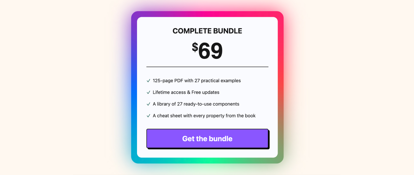
Want to build modern interfaces with less JavaScript?
I wrote a guide about building modern UI with HTML and CSS first. It covers practical patterns you can use before reaching for JavaScript.
Learn moreLayering makes shadows feel real
A single shadow rarely looks natural.
Real shadows are layered: a tight shadow near the object, and softer ones farther away.
Try toggling the layers to see how they combine:
Layer toggles
The simplest pattern is multiple, tightly-spaced layers with the same opacity:
.card {
	box-shadow:
		0 1px 1px hsl(0deg 0% 0% / 0.075),
		0 2px 2px hsl(0deg 0% 0% / 0.075),
		0 4px 4px hsl(0deg 0% 0% / 0.075),
		0 8px 8px hsl(0deg 0% 0% / 0.075),
		0 16px 16px hsl(0deg 0% 0% / 0.075);
}
Think of these as zones:
- Contact shadow (first lines): short blur, higher visual density. This anchors the card to the surface.
- Ambient shadow (last lines): large blur, faint opacity. This creates the soft halo that feels natural.
Notice how the blur radius grows at the same rate as the offsets in this example. That even scaling creates a smooth, natural falloff.
If the shadow still feels too puffy, try adding a small negative spread on the tightest layer.
Layered shadows are also more expensive to render. Keep the count low and avoid animating layered shadows on large elements.
Color-match your shadows
Neutral black shadows can look muddy on colorful surfaces.
To keep the shadow believable, match its hue to the environment and adjust saturation/lightness until it feels right.
body {
	--background: hsl(220deg 100% 80%);
	background-color: var(--background);
}

.card {
	background-color: #fff;
	box-shadow: 1px 2px 8px var(--shadow-color);
}

.card--too-gray {
	--shadow-color: hsl(0deg 0% 0% / 0.5);
}
.card--too-bright {
	--shadow-color: hsl(from var(--background) h s 50%);
}
.card--just-right {
	--shadow-color: hsl(from var(--background) h 60% 50%);
}
The “just right” version keeps the hue but lowers saturation and lightness, so the shadow belongs to the scene instead of floating on top.
Bonus: drop-shadow
box-shadow always uses the element’s box.
filter: drop-shadow() follows the actual rendered shape, including transparent parts. Under the hood, drop-shadow() uses an SVG gaussian blur, so it looks and behaves a little differently than box-shadow.
It’s perfect for speech bubbles, cutouts, or icons. You can also stack multiple drop-shadow() calls to get a richer falloff:
Tail gets no shadow
Shadow follows the shape
Here is the basic HTML and the tiny CSS that creates the bubble tip:
<div class="bubble">Bubble text</div>.bubble {
position: relative;
background: white;
padding: 1rem 1.2rem;
border-radius: 10px;
--shadow: hsl(0deg 0% 0% / 0.2);
}
.bubble::after {
content: '';
position: absolute;
left: 26px;
bottom: -20px;
width: 34px;
height: 24px;
background: inherit;
clip-path: polygon(50% 100%, 0 0, 100% 0);
}.bubble {
filter: drop-shadow(1px 2px 3px var(--shadow)) drop-shadow(2px 4px 6px var(--shadow))
drop-shadow(4px 8px 12px var(--shadow));
}In many cases, drop-shadow() can be faster because filter effects can be GPU-accelerated. That said, Safari can struggle with filtered elements that contain inputs, so test before applying it broadly.
Final thoughts
Shadows don’t need to be complicated.
Pick a light source, scale your numbers, layer your blur, and tint the color.
That’s enough to make your UI feel more intentional and more real.
Support My Work
Feel free to leave your comments or questions by email at hey@theosoti.com.
If you found this article helpful, please share it with your peers and join my newsletter below for more web development tutorials.
Happy coding!