⚠️ Your browser does not support Scroll-Linked Animations. To cater for this, a polyfill has been loaded.
Introduction to scroll-driven animations
Scroll-driven animations are a great way to enhance web experiences by tying animations to scrolling. Think of parallax effects, where backgrounds shift as you scroll, or elements that fade in as they come into view.
In the past, creating these effects meant handling scroll events (with javascript) on the main thread, which often led to choppy results. But with the Scroll-driven Animations specification, you can now create smooth, responsive animations declaratively.
These new APIs work seamlessly with the Web Animations API and CSS Animations API, allowing scroll-driven animations to run off the main thread.
The result? Silky-smooth animations that are easy to implement with just a few lines of code.
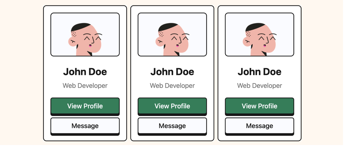
Here is an example of a component working with the scroll-driven animation:
Scroll Timeline
By default, animations run on the document’s main timeline, where time determines progress. But with the new Scroll Timeline API, you can make animations scroll-driven. Instead of progressing over a fixed duration, the animation’s progress is tied directly to the scroll position of a scroll container.
Here’s how it works:
- At 0% progress, the animation corresponds to the start of the scroll.
- At 100% progress, the animation completes at the end of the scroll.
This approach allows you to control animations dynamically through scrolling, offering a more interactive experience.
To illustrate, here’s a simple animation that runs as soon as the page loads. The element scales horizontally over a fixed two-second duration:
@keyframes progress {
	from {
		transform: scaleX(0);
	}
	to {
		transform: scaleX(1);
	}
}

#progress {
	animation: progress 2s linear infinite running;
}Now, let’s make this animation scroll-driven. With the animation-timeline property and scroll() function, the animation’s progress is tied to the scroll position. We no longer need to define a fixed duration neither an iteration count, as the scroll position determines the timing:
@keyframes progress {
	from {
		transform: scaleX(0);
	}
	to {
		transform: scaleX(1);
	}
}

#progress {
	animation: progress linear forwards;
	animation-timeline: scroll();
}⚠️ Your browser does not support Scroll-Linked Animations. Please use Chrome 115 or newer.
⏬ Scroll Me ⏬
By default, the scroll() function uses the nearest scrollable ancestor as the scroller. But it can also take two optional parameters to customize its behavior:
<axis>: Specifies the axis of scrolling that drives the animation.- Possible values: block (default), inline, x, or y.
<scroller>: Specifies the scroll container element whose scroll position drives the animation.- Possible values: nearest (default), root, or self.
With these options, you can fine-tune the behavior of scroll-driven animations to match your design needs.
View Timeline
The View Timeline is a specialized type of scroll timeline. While it responds to scrolling, it behaves more like the JavaScript Intersection Observer API. The key difference is that the animation progress starts only when the target element begins entering the viewport and ends when it leaves the viewport.
Just like with scroll-driven animations, we use the animation-timeline property, but this time we call the view() function instead of scroll().
The view() function can take two optional parameters:
<axis>: Determines the axis of scrolling that drives the animation progress.- Possible values: block (default), inline, x, or y.
<view-timeline-inset>: Adjusts the visibility range for the animation progress within the viewport.- Possible values: auto (default) or a custom
<length-percentage>value.
- Possible values: auto (default) or a custom
Unlike the scroll() function, there’s no scroller parameter here. The view() function always uses the nearest scrollable ancestor as its reference.
Here’s an example where images fade & slide in as they become visible in the viewport:
@keyframes fade-in {
	to {
		opacity: 1;
		transform: translateX(0);
	}
}

.image {
	opacity: 0.2;
	transform: translateX(-100px);

	animation: fade-in linear forwards;
	animation-timeline: view();
}Lorem ipsum dolor sit amet, consectetur adipiscing elit. Nullam aliquam, neque eget ornare fermentum, tellus augue bibendum ante, ac mattis purus mauris nec nunc. Donec vel orci iaculis, vehicula risus at, finibus dolor. Pellentesque rhoncus pellentesque faucibus. Mauris id feugiat augue. Aenean ut odio luctus lorem tristique sollicitudin ut a elit. Pellentesque et pharetra nunc. Proin at suscipit ante. Proin aliquam massa accumsan, convallis orci at, laoreet erat. Nam dictum facilisis auctor. Aenean ac efficitur est. Integer non leo ut magna semper imperdiet. Orci varius natoque penatibus et magnis dis parturient montes, nascetur ridiculus mus. Sed tristique lectus et finibus pretium.
Lorem ipsum dolor sit amet, consectetur adipiscing elit. Nullam aliquam, neque eget ornare fermentum, tellus augue bibendum ante, ac mattis purus mauris nec nunc. Donec vel orci iaculis, vehicula risus at, finibus dolor. Pellentesque rhoncus pellentesque faucibus. Mauris id feugiat augue. Aenean ut odio luctus lorem tristique sollicitudin ut a elit. Pellentesque et pharetra nunc. Proin at suscipit ante. Proin aliquam massa accumsan, convallis orci at, laoreet erat. Nam dictum facilisis auctor. Aenean ac efficitur est. Integer non leo ut magna semper imperdiet. Orci varius natoque penatibus et magnis dis parturient montes, nascetur ridiculus mus. Sed tristique lectus et finibus pretium.
Lorem ipsum dolor sit amet, consectetur adipiscing elit. Nullam aliquam, neque eget ornare fermentum, tellus augue bibendum ante, ac mattis purus mauris nec nunc. Donec vel orci iaculis, vehicula risus at, finibus dolor. Pellentesque rhoncus pellentesque faucibus. Mauris id feugiat augue. Aenean ut odio luctus lorem tristique sollicitudin ut a elit. Pellentesque et pharetra nunc. Proin at suscipit ante. Proin aliquam massa accumsan, convallis orci at, laoreet erat. Nam dictum facilisis auctor. Aenean ac efficitur est. Integer non leo ut magna semper imperdiet. Orci varius natoque penatibus et magnis dis parturient montes, nascetur ridiculus mus. Sed tristique lectus et finibus pretium.
It’s nice but not perfect. We never see the full image at 100% opacity. The image should have full opacity at around 50% of the viewport.
The initial idea might be to adjust the keyframes to end at 50%.
While this approach could work, it’s not easy to maintain. For example:
@keyframes fade-in {
	0% {
		opacity: 0.2;
		transform: translateX(0);
	}
	50% {
		opacity: 1;
		transform: translateX(1);
	}
}
Thankfully, there is an easier way to do this. You can adjust your animation attachment with timeline ranges.

Want to build modern interfaces with less JavaScript?
I wrote a guide about building modern UI with HTML and CSS first. It covers practical patterns you can use before reaching for JavaScript.
Learn moreTimelines Ranges
To further customise scroll-driven animations, you can use the animation-range property in combination with animation-timeline. This property allows you to define the exact range within which your animation should run.
By default, animation-range is set to normal normal, which is shorthand for animation-range-start: normal; and animation-range-end: normal;. This default configuration corresponds to the animation running from 0% to 100% of the timeline. In CSS terms, it can be expressed as: animation-range: 0% 100%;
But you’re not limited to percentages! The animation-range property lets you specify lengths or percentages to fine-tune when the animation starts and ends relative to the scroll position.
For instance, if we get back to our previous example, you can define an animation that starts when the scroll offset reaches 100px and ends at 50%:
@keyframes fade-in {
	to {
		opacity: 1;
	}
}

.image {
	opacity: 0.2;
	transform: translateX(-100px);

	animation: fade-in linear forwards;
	animation-timeline: view();
	animation-range: 100px 50%;
}Lorem ipsum dolor sit amet, consectetur adipiscing elit. Nullam aliquam, neque eget ornare fermentum, tellus augue bibendum ante, ac mattis purus mauris nec nunc. Donec vel orci iaculis, vehicula risus at, finibus dolor. Pellentesque rhoncus pellentesque faucibus. Mauris id feugiat augue. Aenean ut odio luctus lorem tristique sollicitudin ut a elit. Pellentesque et pharetra nunc. Proin at suscipit ante. Proin aliquam massa accumsan, convallis orci at, laoreet erat. Nam dictum facilisis auctor. Aenean ac efficitur est. Integer non leo ut magna semper imperdiet. Orci varius natoque penatibus et magnis dis parturient montes, nascetur ridiculus mus. Sed tristique lectus et finibus pretium.
Lorem ipsum dolor sit amet, consectetur adipiscing elit. Nullam aliquam, neque eget ornare fermentum, tellus augue bibendum ante, ac mattis purus mauris nec nunc. Donec vel orci iaculis, vehicula risus at, finibus dolor. Pellentesque rhoncus pellentesque faucibus. Mauris id feugiat augue. Aenean ut odio luctus lorem tristique sollicitudin ut a elit. Pellentesque et pharetra nunc. Proin at suscipit ante. Proin aliquam massa accumsan, convallis orci at, laoreet erat. Nam dictum facilisis auctor. Aenean ac efficitur est. Integer non leo ut magna semper imperdiet. Orci varius natoque penatibus et magnis dis parturient montes, nascetur ridiculus mus. Sed tristique lectus et finibus pretium.
Lorem ipsum dolor sit amet, consectetur adipiscing elit. Nullam aliquam, neque eget ornare fermentum, tellus augue bibendum ante, ac mattis purus mauris nec nunc. Donec vel orci iaculis, vehicula risus at, finibus dolor. Pellentesque rhoncus pellentesque faucibus. Mauris id feugiat augue. Aenean ut odio luctus lorem tristique sollicitudin ut a elit. Pellentesque et pharetra nunc. Proin at suscipit ante. Proin aliquam massa accumsan, convallis orci at, laoreet erat. Nam dictum facilisis auctor. Aenean ac efficitur est. Integer non leo ut magna semper imperdiet. Orci varius natoque penatibus et magnis dis parturient montes, nascetur ridiculus mus. Sed tristique lectus et finibus pretium.
Lorem ipsum dolor sit amet, consectetur adipiscing elit. Nullam aliquam, neque eget ornare fermentum, tellus augue bibendum ante, ac mattis purus mauris nec nunc. Donec vel orci iaculis, vehicula risus at, finibus dolor. Pellentesque rhoncus pellentesque faucibus.
In this example:
- The animation begins when the element’s scroll offset reaches 100px.
- The animation completes as the scroll offset reaches 50%.
This flexibility allows you to create more precise, visually engaging animations that align perfectly with your design goals.
With that there are already a lot of scroll animations possible with pure CSS.
Browser Support
Scroll-driven animations in CSS are gaining attention but aren’t yet universally supported. Currently, they have around 74% global support. While Chrome and Edge support them starting from version 115, Safari and Firefox have yet to implement this feature.
However, this shouldn’t discourage us from using scroll-driven animations. They can be implemented as a progressive enhancement, meaning non-critical animations won’t affect the overall user experience if they aren’t visible in unsupported browsers.
To handle browser compatibility, the @supports() rule in CSS allows you to check if a specific property is supported. This makes it easy to add fallbacks or even display warning messages for unsupported browsers. Additionally, polyfills are available to bring scroll-driven animations to more browsers, ensuring a wider reach.
Tools & Resources
To visualise and debug Scroll-Driven Animations on your own site: Scroll-Driven Animations Debugger extension for Chrome DevTools.
To visualise all the possible outcome for the view timeline ranges: scroll-driven-animations.style/tools/view-timeline/ranges
To deep dive into scroll driven animations: scroll-driven-animations.style.
Great video from Kevin Powell about scroll driven animations: youtube.com/watch?v=UmzFk68Bwdk.
Support My Work
Feel free to leave your comments or questions by email at hey@theosoti.com.
If you found this article helpful, please share it with your peers and join my newsletter below for more web development tutorials.
Happy coding!

