CSS transitions had a missing piece
If you ever tried to fade in a dialog, a popover, or any element that goes from display: none to visible, you probably hit the same wall: the transition just would not run.
That is exactly the problem @starting-style solves.
The short version is simple:
- CSS transitions normally need a previous rendered state.
- Elements coming from
display: nonedo not really have one. @starting-stylegives the browser that missing starting point.
It only applies to transitions, not @keyframes animations. If you are already using keyframes, @starting-style is not the tool you need.
Why transitions fail in the first place
CSS transitions interpolate between two rendered states.
That sounds obvious, but it explains the limitation.
When an element is hidden with display: none, there is no box to transition from. And when an element appears for the first time, the browser does not have a previous visible state to animate away from.
So code like this looks reasonable, but it won’t give you a proper entry transition:
.toast {
	display: none;
	opacity: 0;
	transform: translateY(12px);
	transition:
		opacity 0.25s ease,
		transform 0.25s ease,
		display 0.25s allow-discrete;
}

.toast.is-open {
	display: block;
	opacity: 1;
	transform: translateY(0);
}
You have the closed state.
You have the open state.
But you still don’t have a real starting state for the moment the element first becomes visible.
That is the gap @starting-style fills.
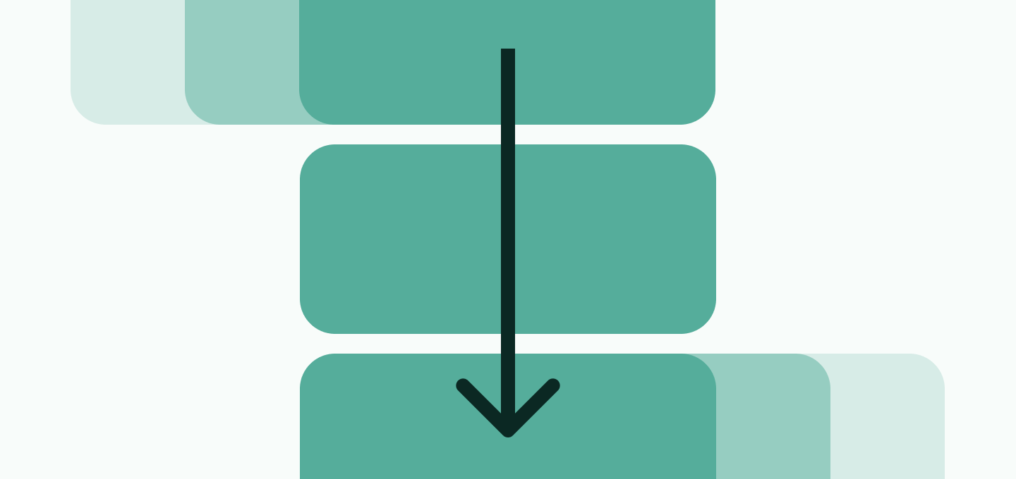
Without @starting-style
With @starting-style
The real mental model: three states
This is the part that makes @starting-style click.
In practice, you are not managing two states.
You are managing three:
- The closed or default state
- The open state
- The starting state used only for the entry transition
Here is the same example with all three states written explicitly:
.toast {
	display: none;
	opacity: 0;
	transform: translateY(12px);
	transition:
		opacity 0.25s ease,
		transform 0.25s ease,
		display 0.25s allow-discrete;
}

.toast.is-open {
	display: block;
	opacity: 1;
	transform: translateY(0);
}

@starting-style {
	.toast.is-open {
		display: block;
		opacity: 0;
		transform: translateY(12px);
	}
}
Now the browser knows:
- what the element looks like when it is closed
- what it should look like when it is open
- what values it should transition from when it first appears
This repeated display: block is the part many developers find weird the first time.
It feels redundant, but it is necessary.
The element must be considered visible for the browser to animate its visible properties.
Want to build modern interfaces with less JavaScript?
I wrote a guide about building modern UI with HTML and CSS first. It covers practical patterns you can use before reaching for JavaScript.
Learn moreWhy @starting-style feels a bit strange
There are two details that make this feature feel more confusing than it really is.
The first is repetition.
You often repeat some values between the closed state and the starting state, especially opacity and transform values.
The second is order.
@starting-style does not create any special cascade priority. It has the same specificity as the rule it mirrors, so it needs to come after the open-state rule.
This works:
.toast.is-open {
	opacity: 1;
	transform: translateY(0);
}

@starting-style {
	.toast.is-open {
		opacity: 0;
		transform: translateY(12px);
	}
}
This does not:
@starting-style {
	.toast.is-open {
		opacity: 0;
		transform: translateY(12px);
	}
}

.toast.is-open {
	opacity: 1;
	transform: translateY(0);
}
If you put the starting styles first, the open rule simply overrides them before the transition can use them.
Where @starting-style becomes genuinely useful
The best use cases are not decorative hover effects.
The real value shows up when elements:
- enter the DOM
- change from
display: none - move into the top layer
That means things like:
- dialogs
- popovers
- toasts
- drawers
- menus
These are exactly the components that used to need extra JavaScript choreography just to animate in cleanly.
With @starting-style, the CSS can own more of that behavior.
This solves the motion part of the component. For the same dialog or popover, commandfor can handle opening and closing, while CSS Anchor Positioning can place a popover beside its trigger. Each feature has a separate job, so you can use them together without tying the interaction to one large script.
A dialog example
Native <dialog> is a great example because it already has a clear open/closed lifecycle.
dialog {
	opacity: 0;
	transform: translateY(16px) scale(0.98);
	transition:
		opacity 0.25s ease,
		transform 0.25s ease,
		overlay 0.25s allow-discrete,
		display 0.25s allow-discrete;
}

dialog[open] {
	opacity: 1;
	transform: translateY(0) scale(1);
}

@starting-style {
	dialog[open] {
		opacity: 0;
		transform: translateY(16px) scale(0.98);
	}
}
Here the browser handles the dialog’s visibility state for you.
You are mostly defining the visual transition.
If you also want to animate the backdrop, use a standalone block:
dialog::backdrop {
	background-color: rgb(0 0 0 / 0);
	transition:
		background-color 0.25s ease,
		overlay 0.25s allow-discrete,
		display 0.25s allow-discrete;
}

dialog[open]::backdrop {
	background-color: rgb(0 0 0 / 0.35);
}

@starting-style {
	dialog[open]::backdrop {
		background-color: rgb(0 0 0 / 0);
	}
}
That gives you a cleaner, fully CSS-driven entry effect for both the panel and its backdrop.
Entry and exit do not have to match
This is another subtle but powerful part of @starting-style.
The starting state is only used for the entry transition.
When the component closes again, the browser transitions back to the normal closed state.
So the in and out motions can be different.
.panel {
	display: none;
	opacity: 0;
	transform: translateX(40px);
	transition:
		opacity 0.3s ease,
		transform 0.3s ease,
		display 0.3s allow-discrete;
}

.panel.is-open {
	display: block;
	opacity: 1;
	transform: translateX(0);
}

@starting-style {
	.panel.is-open {
		display: block;
		opacity: 0;
		transform: translateX(-40px);
	}
}
This panel enters from the left, but exits to the right.
That is a nice pattern for drawers, notifications, or stacked UI where the direction helps communicate intent.
Browser support and production use
According to MDN, @starting-style is Baseline 2024 and has worked across the latest browser versions since August 2024.
That said, “Baseline” does not mean “safe for every device your users might still have”.
Older browsers will simply skip the entry transition.
That is why I see @starting-style as a very good progressive enhancement:
- the component still works
- the UI just appears without the nicer transition
That is a good tradeoff.
If the animation is essential to understanding the interface, do not rely on it alone.
But for dialogs, menus, drawers, and other UI polish, it is a strong modern CSS tool.
Final thoughts
@starting-style is not hard because the syntax is complicated.
It feels hard because it forces you to think in one extra state: not just closed and open, but also the temporary starting state used for the first transition.
Once that clicks, the feature becomes much more predictable.
And more importantly, it removes one more category of JavaScript that used to exist mostly to patch a CSS limitation.
That is exactly the kind of feature I like seeing in the platform.
Enjoyed this article?
I write about modern CSS, HTML, and simpler ways to build for the web.
Join my newsletter below if you want more tutorials like this. Happy coding!