Did you know there are 4 different focus states in CSS?
One of them is secret 🤫
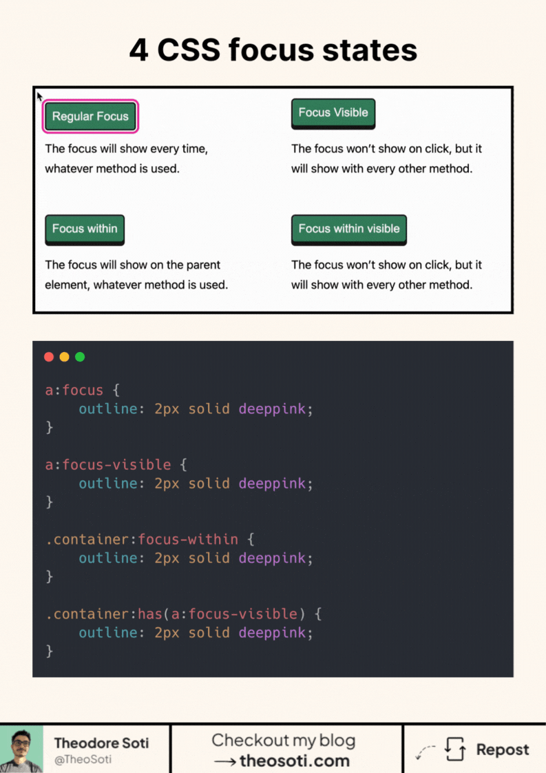
CSS Focus states might seem straightforward at first. In reality, there are multiple selectors that control how and when focus is displayed on elements. There are three primary focus states in CSS, plus a “secret” fourth one.
Here are the 3 main CSS focus:
- :focus the most common one
- :focus-visible, it’s like :focus, but visible only on certain conditions
- :focus-within will focus the container element when one of its children is focused
For the fourth one, you can go check my blog article here: https://theosoti.com/blog/css-focus-hack/
Understanding how to use these focus states correctly can elevate accessibility, create smoother interfaces, and improve user navigation.
Separating focus states by intent improves both accessibility and visual clarity. Using :focus, :focus-visible, and container states deliberately prevents noisy outlines while preserving strong keyboard feedback.
Using focus states deliberately (:focus, :focus-visible, and container variants) improves keyboard UX and avoids noisy outlines for mouse users.
Validate it with real content and realistic viewport ranges so implementation details hold up outside demos.
A practical way to adopt :focus is to scope it to one high-impact component first. After validation, expand gradually to matching components and avoid ad-hoc one-off overrides.
Before final rollout, validate :focus against real content and real interaction states, not only demo text.
If you liked this tip, you might enjoy the book, which is packed with similar insights to help you build better websites without relying on JavaScript.
Go check it out https://theosoti.com/you-dont-need-js/ and enjoy 20% OFF for a limited time!