Write cleaner Flexbox with these 4 shorthands.
Why write 3 lines… When one will do the trick?
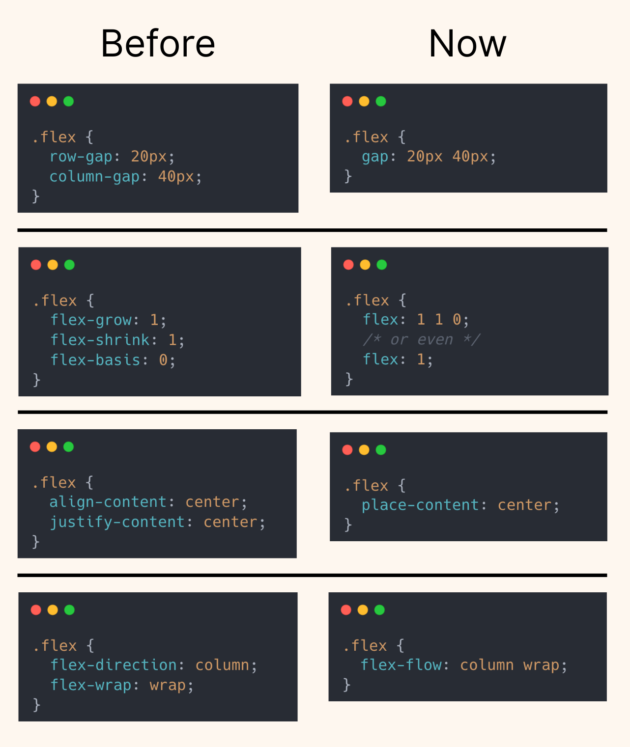
Flexbox has powerful shorthand properties that reduce clutter and make your CSS easier to read and maintain.
Here, I’ve condensed: row-gap + column-gap → gap: row col flex-grow + flex-shrink + flex-basis → flex: 1 1 0 (or just flex: 1) align-content + justify-content → place-content flex-direction + flex-wrap → flex-flow
These shorthands do exactly the same thing, just smarter and more scalable.
Pro tip: If you’re building reusable components or utility classes, using shorthands is a great way to reduce CSS bloat.
Shorthands are powerful, but clarity still matters. For example, flex: 1 is convenient, yet flex: 1 1 0 can be clearer when teaching or debugging layout behavior.
A good rule is to use shorthands in stable patterns (utilities and components), and keep longhand when intent might be ambiguous. That balance keeps stylesheets compact without hiding critical layout logic.
Flexbox shorthands reduce boilerplate, but they are best when intent stays explicit. Use compact forms in stable utilities, and expand longhand only when you need clearer debugging around sizing behavior.
Flexbox shorthands reduce clutter, but clarity still matters. Use compact syntax for stable utilities and keep longhand when explicit behavior helps debug complex sizing issues.
Validate it with real content and realistic viewport ranges so implementation details hold up outside demos.
To roll this out safely, start by applying flex: 1 in a single UI surface where the benefit is obvious. Then reuse that same pattern in similar contexts so behavior stays consistent and review time stays low.
If you liked this tip, you might enjoy the book, which is packed with similar insights to help you build better websites without relying on JavaScript.
Go check it out https://theosoti.com/you-dont-need-js/ and enjoy 20% OFF for a limited time!