Animated text gradients with pure CSS?
Yes, it’s possible, and surprisingly smooth.
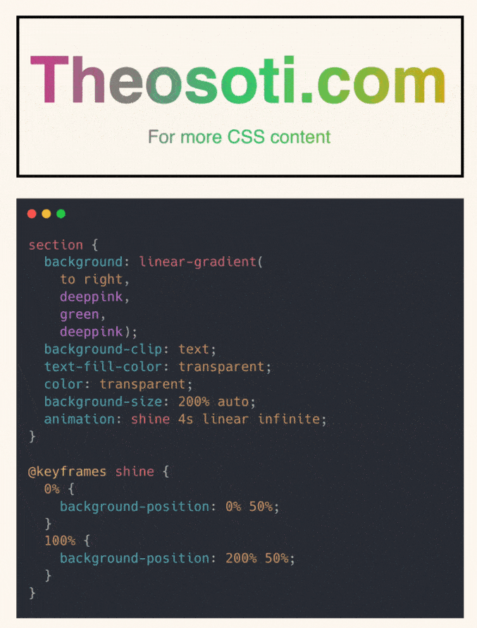
This technique uses background-clip: text to apply a gradient directly to the text.
It then animates the background to create a subtle shimmering effect.
A few things that make it work:
- Set the text color to
transparentso only the background shows through. - Use
background-size: 200% autoto give the gradient space to move. - Animate the
background-positionwith keyframes to create motion. - Repeat the first color at the end of your gradient (color1 → color2 → color1) to make the loop seamless.
No JavaScript needed. Just clever layering with modern CSS.
Support is solid across Chromium and WebKit browsers, with Firefox catching up.
Here’s the codepen: https://codepen.io/theosoti/pen/ogNoRPp
Animated text gradients are most effective when motion stays restrained and contrast remains high. The static state should still read clearly, so users with reduced motion preferences keep full readability.
Animated text gradients should be treated as accent motion, not core content delivery. Keep fallback readability strong so users still understand the message without animation.
Use this as a readability tool, not only a visual effect. The best result is when style improves scanning speed without adding cognitive load.
A practical way to adopt background-clip: text is to scope it to one high-impact component first. After validation, expand gradually to matching components and avoid ad-hoc one-off overrides.
If you liked this tip, you might enjoy the book, which is packed with similar insights to help you build better websites without relying on JavaScript.
Go check it out https://theosoti.com/you-dont-need-js/ and enjoy 20% OFF for a limited time!