Still using JavaScript for an autoplay carousel?
You don’t need to anymore.
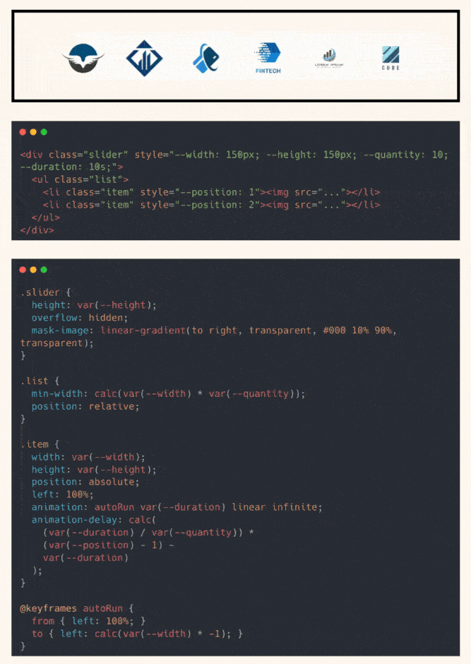
A one-directional, looping logo strip can now be built entirely with CSS.
No setInterval. No libraries. No layout shifts.
Here’s how it works: You define a few CSS custom properties:
--widthand--heightto size each item--quantityto set how many elements are in the loop--durationfor how long one full cycle takes
Each item gets a --position, so we can stagger its animation using animation-delay.
This formula spaces each item evenly:
calc((var(--duration)/var(--quantity)) * (var(--position) - 1) - var(--duration))It ensures that the track starts full, no empty gaps at load.
The animation itself is simple:
From left: 100% to left: -width, sliding items across the track.
We use position: absolute so every item animates independently,
and overflow: hidden on the container to act as a viewport.
For a smooth entrance and exit, we apply a mask-image gradient.
This fades logos in/out without extra DOM or performance hits.
Accessibility? Covered.
Each logo gets tabindex="0" so keyboard users can focus them,
and the entire animation pauses on hover or focus using :has(:focus) and animation-play-state: paused.
No JavaScript.
Just CSS, doing what used to take 100KB+ of JS.
Checkout the codepen: https://codepen.io/theosoti/pen/OPVeegy
Autoplay carousels should never hide control from users. Keep pause/stop behavior clear and predictable, and ensure content remains readable without waiting for automatic cycles.
Motion should clarify state change, not distract from content. Keep timings short and ensure users can still complete actions quickly.
If you liked this tip, you might enjoy the book, which is packed with similar insights to help you build better websites without relying on JavaScript.
Go check it out https://theosoti.com/you-dont-need-js/ and enjoy 20% OFF for a limited time!