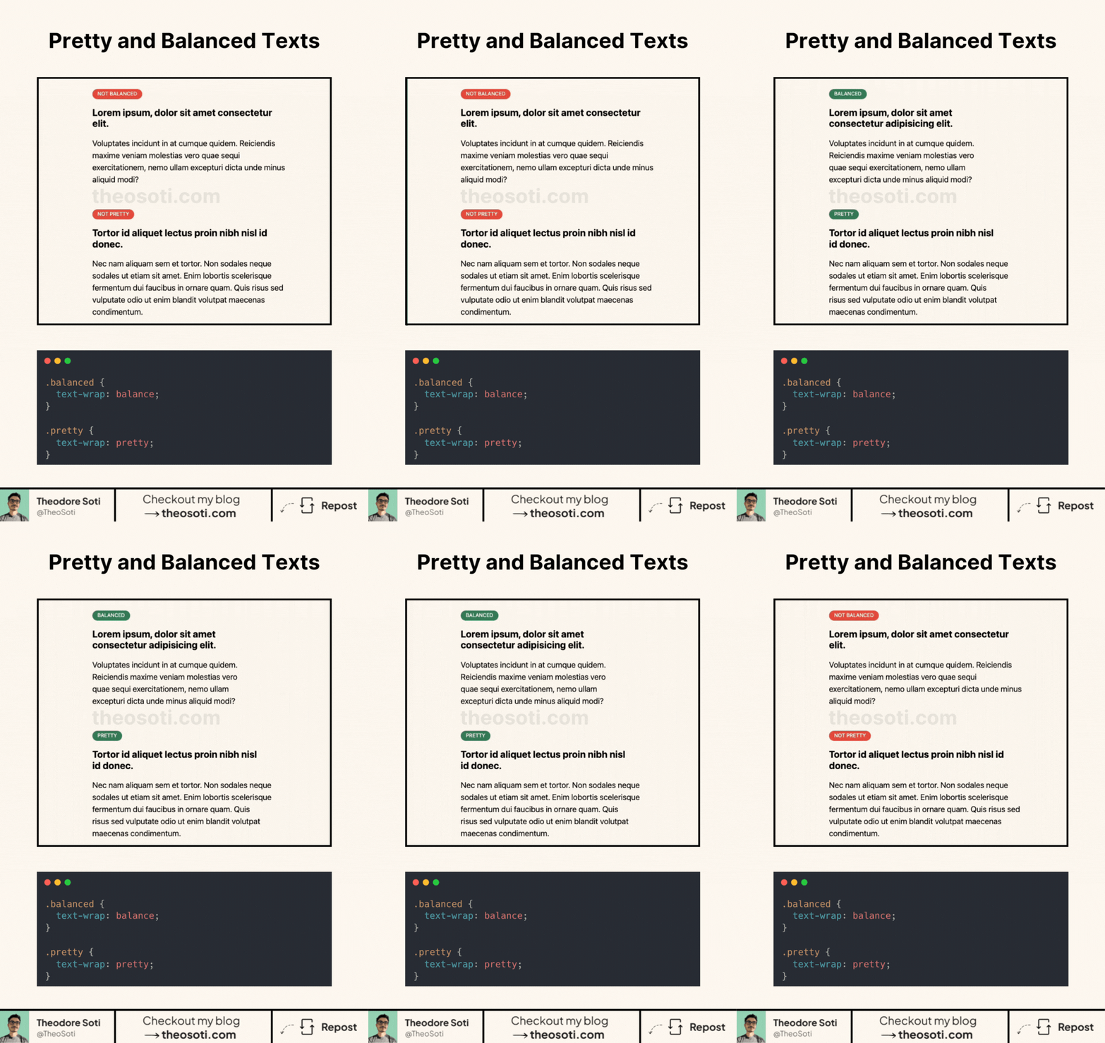
No more awkward text wrapping. Let CSS handle it beautifully.
CSS gives us two new ways to make typography more visually pleasing:
- text-wrap: balance;
- text-wrap: pretty;
What’s the difference?
1 - text-wrap: balance; It makes sure each line has a similar length, preventing one-word last lines or uneven spacing. Perfect for headlines or short text blocks.
2 - text-wrap: pretty; It optimizes letter and word spacing to create a more natural and visually appealing text flow. Great for longer paragraphs where readability is key.
Why should you care?
- No more weird line breaks.
- More control over how text is displayed.
- Better readability without extra HTML or JS.
Browser support is already at ~88%. It’s not perfect, but since unsupported browsers just ignore it, there’s no downside.
Simple CSS tricks make a huge difference.
.balanced {
  text-wrap: balance;
}

.pretty {
  text-wrap: pretty;
}
Full code available here: https://codepen.io/theosoti/pen/VYwBRBK
text-wrap: balance works best for short headings, while text-wrap: pretty improves long paragraphs by reducing awkward line endings. Choosing the mode per content type creates cleaner rhythm without manual line breaks.
text-wrap: balance works best on short headings, while text-wrap: pretty improves long paragraphs by reducing awkward endings. Using each mode intentionally gives cleaner rhythm across content types.
Use this as a readability tool, not only a visual effect. The best result is when style improves scanning speed without adding cognitive load.
For teams, text-wrap: balance is easiest to maintain when it starts in one documented example before broader reuse. This keeps implementation predictable and prevents style drift as the codebase grows.
If you liked this tip, you might enjoy the book, which is packed with similar insights to help you build better websites without relying on JavaScript.
Go check it out https://theosoti.com/you-dont-need-js/ and enjoy 20% OFF for a limited time!