You can create gradient borders in pure CSS.
No extra elements. No pseudo-elements. Here’s how it works:
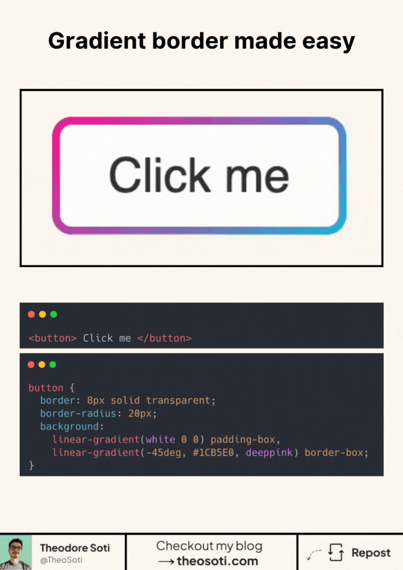
Set a thick transparent border.
Then layer two backgrounds:
- A solid fill using
padding-box - A gradient using
border-box
The transparent border acts as space for the gradient to show through.
It works seamlessly with border-radius.
And because it’s just one element, it keeps your HTML clean.
Now let’s go a step further: animation.
With the @property rule, you can register custom values, like an angle.
That allows CSS to transition between them smoothly.
Define something like --angle for your gradient direction.
Update it on hover or with a keyframe.
CSS will animate the change automatically, no JavaScript needed.
This opens up subtle, lightweight effects for buttons, cards, and more.
And since it’s based on native CSS features, it’s well-supported and performant.
Here’s the codepen: https://codepen.io/theosoti/pen/myJzeKN
Animated gradient borders are visually strong, so moderation matters. They work best on featured surfaces or key CTAs, while everyday components should keep calmer borders for better hierarchy.
Animated gradient borders work best as highlights, not defaults. Use them on featured components and keep everyday surfaces visually calmer to preserve hierarchy.
Always include reduced-motion behavior. A strong animation pattern is one that degrades cleanly while preserving meaning.
A practical way to adopt padding-box is to scope it to one high-impact component first. After validation, expand gradually to matching components and avoid ad-hoc one-off overrides.
If you liked this tip, you might enjoy the book, which is packed with similar insights to help you build better websites without relying on JavaScript.
Go check it out https://theosoti.com/you-dont-need-js/ and enjoy 20% OFF for a limited time!