Before/after slider with just 1 line of JavaScript?
Yes, it’s possible!
Most comparison sliders rely on extra JavaScript, But CSS can do most of the work for us.
How does it work?
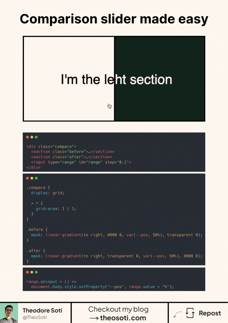
- Both sections and the slider are placed in the same grid cell, ensuring perfect overlap.
- A mask on each section controls its visibility. As the slider moves, one section gradually disappears while the other is revealed.
- The range input updates the mask position dynamically, creating a seamless effect.
Why use this approach?
- No need for complex JavaScript logic.
- CSS handles most of the work efficiently.
- A simple structure with clear separation of concerns.
- Over 95% browser support!
This technique is perfect for image comparisons, UI demos, and interactive before/after effects.
<div class="compare">
  <section class="before">I'm the left section</section>
  <section class="after">I'm the right section</section>
  <input type="range" id="range" step="0.1" />
</div>
.compare {
display: grid;
> * {
grid-area: 1 / 1;
}
}
section {
display: grid;
align-items: center;
justify-content: center;
}
.before {
background-color: #fff8f0;
mask: linear-gradient(to right, #000 0, var(--pos, 50%), transparent 0);
}
.after {
background-color: #122b1f;
mask: linear-gradient(to right, transparent 0, var(--pos, 50%), #000 0);
color: #fff8f0;
}range.oninput = () => document.body.style.setProperty('--pos', range.value + '%');Full code available here: https://codepen.io/theosoti/pen/JojrrgB
For before/after sliders, clarity matters more than novelty. Keep handles discoverable, maintain enough contrast between states, and ensure users can understand the comparison without precise drag control.
A quick edge-case audit with inserted elements helps confirm that selector logic stays predictable over time.
For teams, comparison slider is easiest to maintain when it starts in one documented example before broader reuse. That rollout sequence preserves clarity and reduces regressions during future refactors.
Before final rollout, validate comparison slider against real content and real interaction states, not only demo text.
If you keep a visible divider and clear labels for both states, users understand the comparison instantly without trial-and-error dragging.
If you liked this tip, you might enjoy the book, which is packed with similar insights to help you build better websites without relying on JavaScript.
Go check it out https://theosoti.com/you-dont-need-js/ and enjoy 20% OFF for a limited time!