Responsive design isn’t just about screen size anymore.
Container queries give components the power to adapt on their own. Responsive design isn’t just about screen size anymore.
Container queries give components the power to adapt on their own. That’s where CSS container queries come in. They let you apply styles based on the size of the parent, not the window.
What makes them special:
- Components become truly reusable and context-aware.
- You can build layouts that behave consistently in any environment.
- No more overrides based on where a component happens to land.
How it works:
- Set a container with
container-type: inline-size;. - Inside that container, use
@containerrules to style elements based on width.
Browser support is already strong at ~94%.
Just keep in mind: unsupported browsers will skip @container rules entirely.
So be sure your base styles hold up without them.
Don’t hesitate to read the full article on my blog: https://theosoti.com/blog/container-queries/
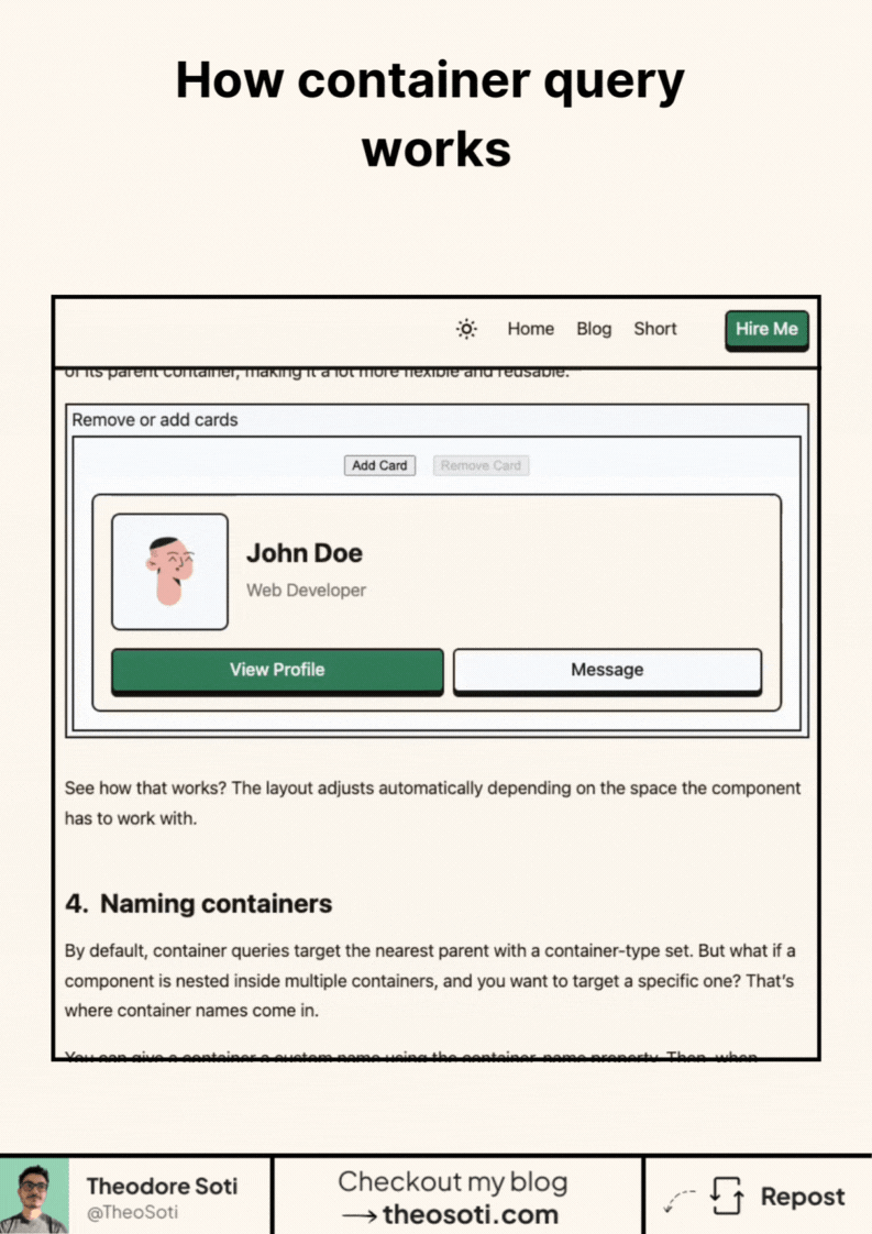
Container queries shine when the same component appears in narrow and wide contexts. Defining behavior from container size, not viewport size, keeps modules reusable without layout-specific overrides.
Container-driven rules make components genuinely reusable across unknown parent layouts. This reduces breakpoint duplication and keeps local behavior tied to actual available space.
Use this pattern to keep responsive behavior local to the component instead of scattering viewport overrides. That makes scaling and refactoring much safer.
If you liked this tip, you might enjoy the book, which is packed with similar insights to help you build better websites without relying on JavaScript.
Go check it out https://theosoti.com/you-dont-need-js/ and enjoy 20% OFF for a limited time!