For years, vh and vw were our go-to viewport units.
But mobile browsers’ dynamic toolbars made 100vh unreliable, causing layout shifts.
Now, CSS gives us better control with new viewport units.
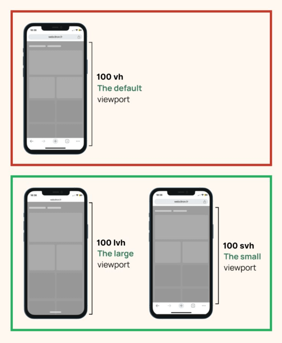
svh/svw→ Small Viewport (when toolbars are fully visible)lvh/lvw→ Large Viewport (when toolbars are fully collapsed)dvh/dvw→ Dynamic Viewport (adjusts in real time as the UI changes)
With these units, layouts can adapt fluidly without sudden jumps when the browser UI changes.
Need a full-height section?
Use 100dvh, and it’ll always fit.
Want a consistent design even when toolbars disappear?
lvh has you covered.
The browser support is already solid at ~95%, so it’s pretty safe to use.
The new viewport units are most useful on mobile screens with dynamic browser bars. Use dvh for live viewport behavior, and keep svh for stable areas like heroes where jumpy resizing would feel distracting.
The new viewport units solve real mobile issues caused by browser UI bars. Use dvh when you want live viewport behavior and prefer svh when you want a stable, non-jumpy section height.
Layout features like this provide real value when components move between narrow and wide containers. Testing nested contexts early prevents brittle breakpoint rules.
A practical way to adopt svh is to scope it to one high-impact component first. Then reuse that same pattern in similar contexts so behavior stays consistent and review time stays low.
For fullscreen sections on mobile, compare svh, lvh, and dvh side by side so you can choose the unit that matches the interaction you want.
If you liked this tip, you might enjoy the book, which is packed with similar insights to help you build better websites without relying on JavaScript.
Go check it out https://theosoti.com/you-dont-need-js/ and enjoy 20% OFF for a limited time!