Subgrid is your new best friend.
Instead of each item defining its own layout, it inherits the parent’s grid structure.
That means:
- No more inconsistent heights.
- No more manually tweaking spacing.
- Everything stays perfectly aligned.
To make it work, it’s simple:
- Set
display: gridon the child element. - Use
grid-template-rows: subgridorgrid-template-columns: subgrid. - Use
grid-row: span 3;(or equivalent) to stretch items across multiple tracks within the parent grid. - The child now follows the parent’s grid.
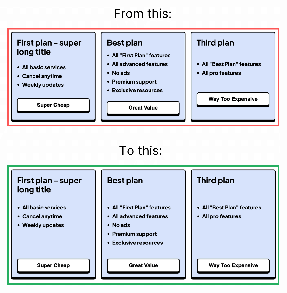
In the pricing card example, all sections stay aligned across all cards, no extra hacks needed.
Subgrid is great in component-based layouts:
- Blog listings where titles, excerpts, and metadata align.
- Feature grids with perfectly balanced headings and descriptions.
- Dashboards where stats and labels need precise positioning.
- Forms with consistent input and label alignment.
Subgrid is reliable for most modern browsers with 91.51% support.
Some older browsers might need fallbacks, so use it as progressive enhancement where needed.
Here is the code:
<section class="container">
  <div class="card">
    <h2>First plan - super long title</h2>
    <p>Content</p>
    <button>Super Cheap</button>
  </div>
  <div class="card">
    <h2>Best plan</h2>
    <p>Content</p>
    <button>Great Value</button>
  </div>
  ...
</section>
.container {
display: grid;
grid-template-columns: 1fr 1fr 1fr;
gap: 1rem;
}
.card {
display: grid;
grid-template-rows: subgrid;
grid-row: span 3;
}subgrid is most useful when child elements must align with a parent track system. It removes repeated grid definitions and keeps vertical rhythm stable across cards and editorial layouts.
Layout features like this provide real value when components move between narrow and wide containers. Testing nested contexts early prevents brittle breakpoint rules.
For teams, display: grid is easiest to maintain when it starts in one documented example before broader reuse. After validation, expand gradually to matching components and avoid ad-hoc one-off overrides.
If you liked this tip, you might enjoy the book, which is packed with similar insights to help you build better websites without relying on JavaScript.
Go check it out https://theosoti.com/you-dont-need-js/ and enjoy 20% OFF for a limited time!