Want to give your paragraphs a touch of editorial flair?
CSS lets you style and position the first letter without any extra markup.
With the :first-letter pseudo-element, you can create drop caps and elegant intros like those seen in magazines.
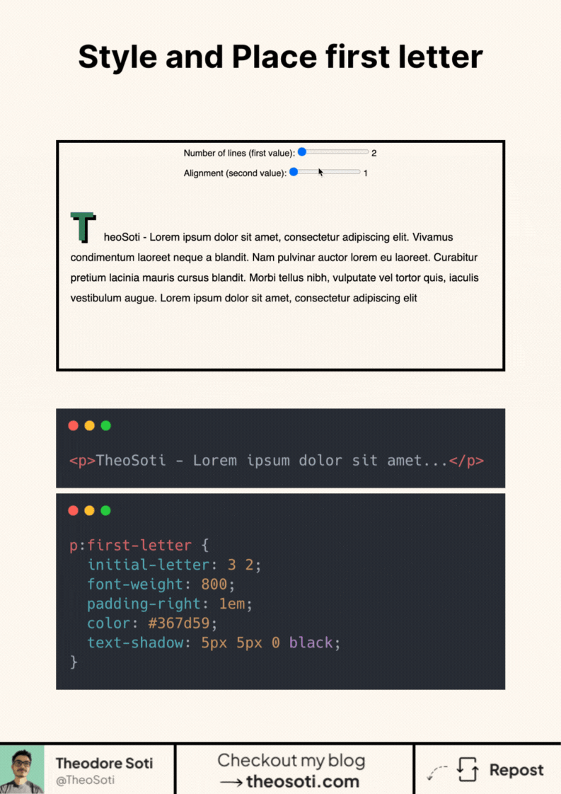
The real magic comes from the initial-letter property. It controls both the size and alignment of the first letter in just one line.
For example:
initial-letter: 3 2; means the letter spans 3 lines and aligns against 2 lines of baseline text.
You can then style it as you want.
Browser support is solid at over 95%.
Have you used :first-letter creatively before? Would love to see it!
Here is a live example: https://codepen.io/theosoti/pen/PwoaJNP
Drop-cap styling is strongest when it supports editorial tone rather than decoration for its own sake. Keep spacing and baseline alignment controlled, especially on small screens where oversized initials can disrupt flow.
Drop-cap styling with :first-letter should support reading tone, not dominate it. Tune spacing carefully so the opening paragraph remains comfortable to scan.
Typography refinements are most visible with real content length and mixed wording. Validate rhythm, spacing, and line breaks on mobile where small issues become obvious.
For teams, initial-letter: 3 2; is easiest to maintain when it starts in one documented example before broader reuse. After validation, expand gradually to matching components and avoid ad-hoc one-off overrides.
On narrow screens, reduce the drop-cap size slightly to keep the first lines readable and avoid awkward text collisions.
If you liked this tip, you might enjoy the book, which is packed with similar insights to help you build better websites without relying on JavaScript.
Go check it out https://theosoti.com/you-dont-need-js/ and enjoy 20% OFF for a limited time!