EM and REM look the same. Until they don’t.
Both are relative units. But they reference different things.
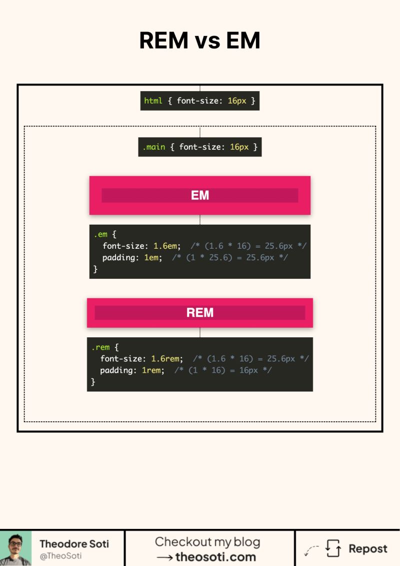
rem is always based on the root font size. Usually the html element.
em is based on the computed font size of the element. Or its parent, depending on what you are sizing.
Here’s the part that confuses people. em can compound.
If you set font-size in em, the element’s font size changes. Then every em value inside that element scales from this new size. Padding. Margin. Gaps. Everything.
rem does not compound. It always goes back to the root.
A quick mental model.
Use rem when you want consistency across the page. Typography scale. Spacing scale. Layout rhythm.
Use em when you want a component to scale with its own text. Buttons. Chips. Badges. Cards with internal spacing tied to font size.
Rule of thumb. rem for global rules. em for local rules.
If you ever got a button that grows too much inside a container, it was probably em compounding.
Do you default to rem everywhere?
A reliable rule is simple: use rem when values should follow the root font size, and use em when values should scale with the component itself. That split keeps accessibility strong while nested components preserve their own rhythm.
A practical rule is simple: use rem for global rhythm and accessibility scaling, and use em when sizing should follow the local component context. This prevents nesting surprises in reusable UI blocks.
Keep fallback behavior explicit and straightforward. Stable defaults make advanced enhancements much safer to maintain.
If you liked this tip, you might enjoy the book, which is packed with similar insights to help you build better websites without relying on JavaScript.
Go check it out https://theosoti.com/you-dont-need-js/ and enjoy 20% OFF for a limited time!