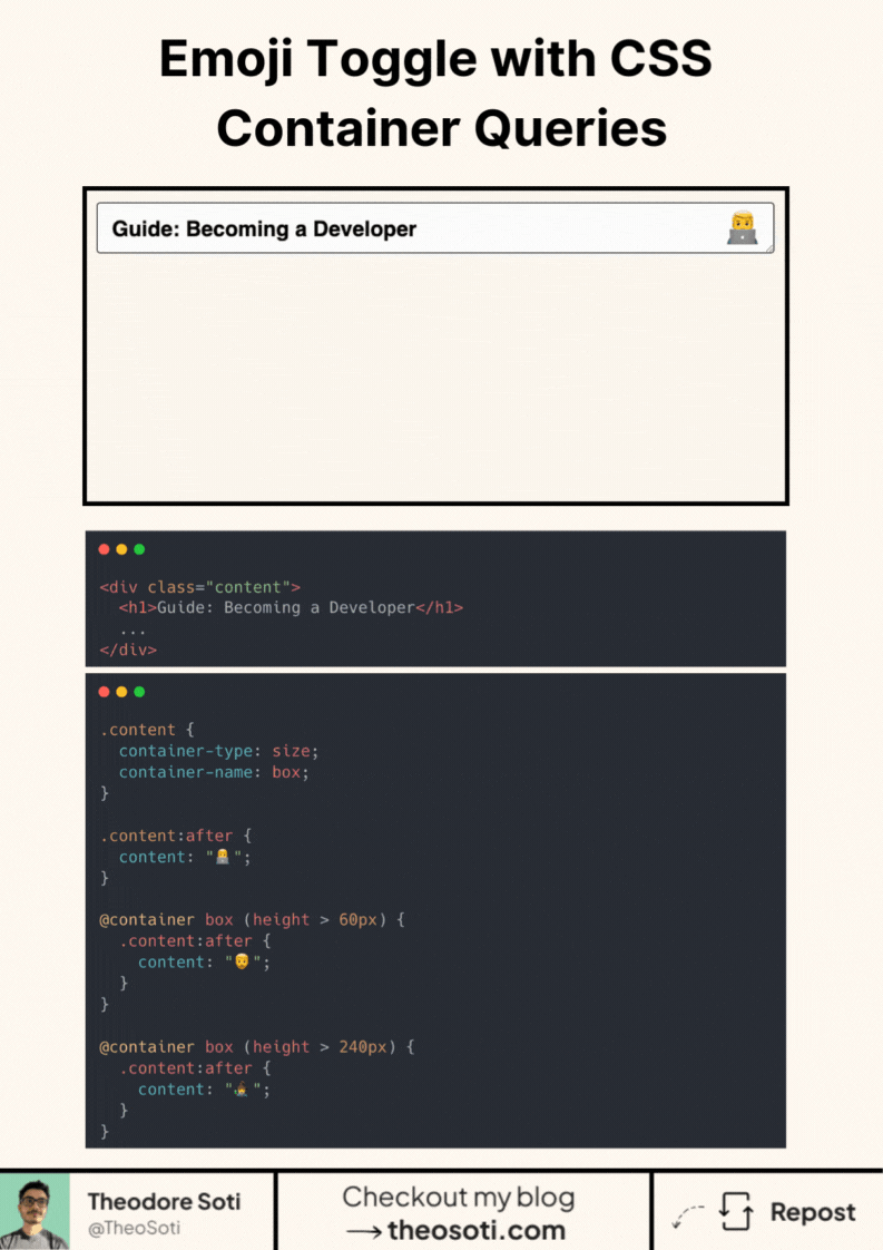
Make components responsive to their parent. Not the viewport.
In the demo, the icon changes based on the content’s height. All with CSS container queries.
Step 1 - declare a container.
Set container-type: size; on the wrapper (optionally container-name: box;).
Step 2 - define a default state.
Use .content:after { content: "default"; } or your base icon.
Step 3 - react to the container, not the page.
Write @container (height > 60px) { .content:after { content: "state-1"; } }.
Add another for a larger breakpoint, e.g. (height > 240px).
As the content grows or shrinks, the pseudo-element swaps automatically. No JavaScript. No viewport media queries. Works inside grids, flex layouts, and nested components.
Support is solid in modern browsers with almost 93%.
Ship a sensible default so it still looks fine where @container isn’t supported.
Container-query-driven components are ideal for small interactive widgets that appear in many parent layouts. Defining behavior from local width keeps them responsive without page-level media-query coupling.
Container-query-driven widgets stay reusable because they respond to local width, not page assumptions. This is ideal for components embedded in many parent contexts.
Before rollout, verify long content, dense cards, and extreme widths. Stable behavior under stress is what turns a neat trick into production CSS.
For teams, container-type: size; is easiest to maintain when it starts in one documented example before broader reuse. That rollout sequence preserves clarity and reduces regressions during future refactors.
If you liked this tip, you might enjoy the book, which is packed with similar insights to help you build better websites without relying on JavaScript.
Go check it out https://theosoti.com/you-dont-need-js/ and enjoy 20% OFF for a limited time!