Ever wondered how to do a light sweep animation?
It’s pretty easy when you understand the logic. I’ll show you here how to do it for a featured card.
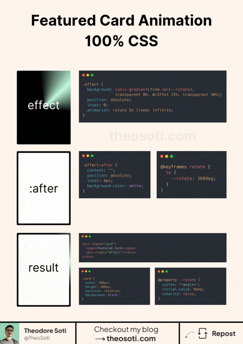
But this can be declined for every components you need. And no JavaScript needed. Let’s break it down into three key parts:
1- The card itself
Start with a container. Add a child div for the animation.
Style it however you like, but don’t forget position: relative. This anchors everything in place.
2- The animation Effect
The rotating light effect uses CSS animations combined with a conic gradient.
The animation layer fills the card with position: absolute and inset: 0.
Use a custom CSS property to control the rotation value.
It makes the animation flexible and easy to tweak.
Next, define a keyframe to rotate the light beam 360 degrees. This will create that smooth sweep effect.
3- Superposing the :after element
To make the card complete, we overlay an :after pseudo-element on the effect. It should sit on top with a slight inset (e.g., 4px) to create a border. This frames the animation and gives it a polished look.
This approach is simple yet powerful.
With just CSS, you can create a dynamic, visually engaging elements that grabs attention.
Card light-sweep effects should be subtle and purposeful. They work well to indicate interactivity, but avoid constant motion that competes with core content.
Always include reduced-motion behavior. A strong animation pattern is one that degrades cleanly while preserving meaning.
If you liked this tip, you might enjoy the book, which is packed with similar insights to help you build better websites without relying on JavaScript.
Go check it out https://theosoti.com/you-dont-need-js/ and enjoy 20% OFF for a limited time!