Media queries aren’t the only solution for responsive design.
With clamp(), you can reduce their use significantly!
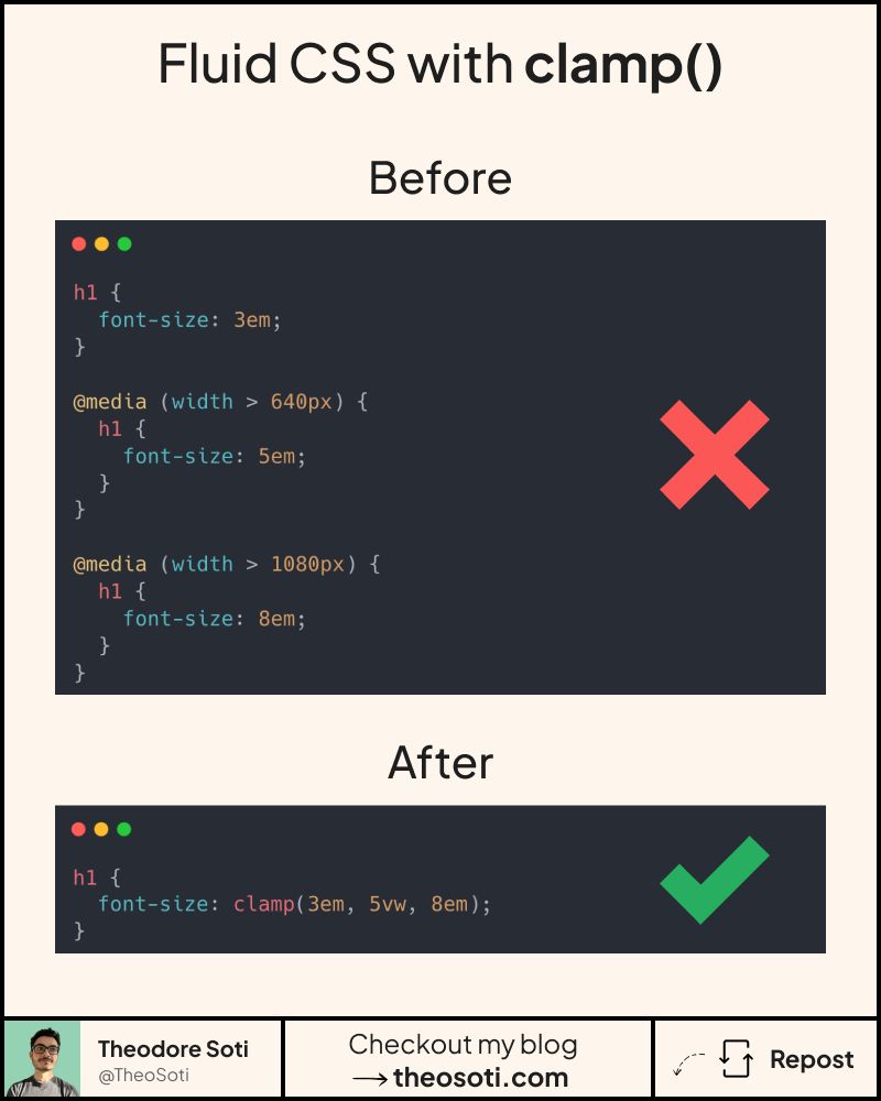
But wait, what is clamp()?
Clamp is a native css function that allow you to specify:
- a minimum value
- a preferred value (usually with % or viewport units)
- a maximum value
Its syntax looks like this: clamp(5em, 30%, 10em)
In short, it makes elements scale smoothly without relying on media queries.
Clamp is often used for padding, margins, width and font-size.
But it can handle anything with numerical values, such as:
aspect-ratio, gap, positioning, …
With ~95.2% browser support, it’s safe to use.
A useful workflow is to start from two breakpoints you already trust, then derive the middle value so interpolation feels natural between them. This keeps fluid scaling intentional, not random.
Clamp also pairs well with design tokens: expose min, ideal, and max values as variables so typography and spacing stay consistent across components while still adapting to viewport changes.
clamp() is most reliable when min and max values come from clear design targets. Tune the middle value carefully, so scaling feels smooth across viewports instead of overreacting on very wide screens.
clamp() performs best when min and max values are grounded in real design limits. Tuning the middle value carefully prevents exaggerated scaling on extreme viewport widths.
Use this pattern to keep responsive behavior local to the component instead of scattering viewport overrides. That makes scaling and refactoring much safer.
If you liked this tip, you might enjoy the book, which is packed with similar insights to help you build better websites without relying on JavaScript.
Go check it out https://theosoti.com/you-dont-need-js/ and enjoy 20% OFF for a limited time!