Want to give your UI a sleek, modern touch?
Try the CSS backdrop-filter property.
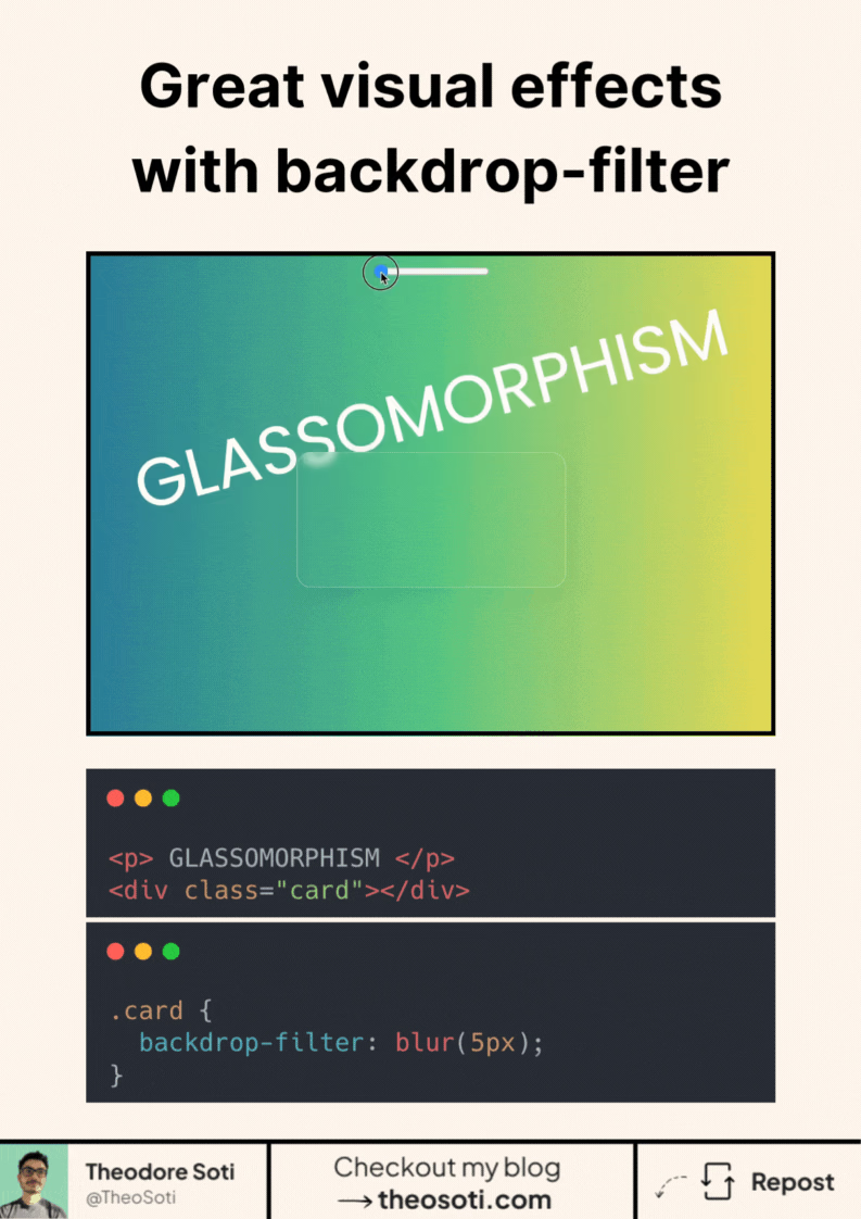
It lets you apply visual effects behind an element, like blur, brightness, or contrast. It’s what creates that soft, frosted-glass look you see in modern UIs.
Here’s how simple it is:
.card {
	backdrop-filter: blur(5px);
}
That’s it.
One line of CSS, and your element blends beautifully into whatever is behind it. You can combine multiple effects: blur(5px) brightness(1.2).
Bonus: It’s widely supported in modern browsers, with more than 96%
Have you tried backdrop-filter yet? Share your favorite use case or a creative twist below.
For best results, pair backdrop-filter with a semi-transparent background (for example rgb(255 255 255 / 0.2)). The filter needs translucency to create that frosted effect visibly.
Add a graceful fallback for unsupported environments: keep a solid or lightly transparent background so contrast stays readable even without blur. Decorative effects should never reduce legibility.
Backdrop blur should support legibility, not reduce it. Combine backdrop-filter with translucent fills and subtle borders, then verify text contrast on busy backgrounds before shipping.
Backdrop blur should support clarity, not reduce it. Combine it with translucent fills and borders, then verify text contrast on busy backgrounds.
Test with multilingual strings and varied word lengths. Typographic CSS should remain graceful when content is unpredictable.
A practical way to adopt backdrop-filter is to scope it to one high-impact component first. This keeps implementation predictable and prevents style drift as the codebase grows.
If you liked this tip, you might enjoy the book, which is packed with similar insights to help you build better websites without relying on JavaScript.
Go check it out https://theosoti.com/you-dont-need-js/ and enjoy 20% OFF for a limited time!