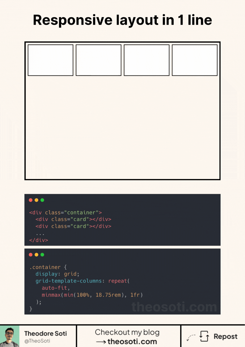
Achieve responsive layouts now with one line of CSS
Let’s analyse the magic behind grid-template-columns:
- Repeat()
- repeat(x, value): generates multiple columns or rows with the same pattern.
- auto-fit: automatically adjusts the number of columns based on available space.
- minmax(min(100%, 18.75rem), 1fr)
- min(100%, 18.75rem): ensures the column never exceeds 18.75rem but also doesn’t exceed the container’s width.
- minmax(…, 1fr): Sets a minimum size while allowing columns to grow and evenly fill available space.
Why this work so well?
- No media queries needed.
- Thanks to min(100%, 18.75rem), elements won’t exceed their container.
- Automatically adapts to different screen sizes and layouts.
- One line does all the work!
All these functions (repeat, minmax, min) have more than 96% browser support.
This one-liner is perfect for card layouts, galleries, and grids that need to be both structured and flexible.
Have you used this approach or a similar one before? Let’s discuss in the comments!
<div class="container">
  <div class="card"></div>
  <div class="card"></div>
  <div class="card"></div>
  <div class="card"></div>
</div>
.container {
display: grid;
gap: 1rem;
/* this line does it all */
grid-template-columns: repeat(auto-fit, minmax(min(100%, 18.75rem), 1fr));
}
.card {
height: 12.5rem;
background: #fff;
border: 4px solid #000;
}Codepen link: https://codepen.io/theosoti/pen/WbNomqr
One-line responsive grids are ideal for content collections where item count changes often. The value is not just shorter CSS; it is predictable wrapping behavior with fewer breakpoint-specific overrides.
Layout features like this provide real value when components move between narrow and wide containers. Testing nested contexts early prevents brittle breakpoint rules.
A practical way to adopt minmax() is to scope it to one high-impact component first. Then reuse that same pattern in similar contexts so behavior stays consistent and review time stays low.
If you liked this tip, you might enjoy the book, which is packed with similar insights to help you build better websites without relying on JavaScript.
Go check it out https://theosoti.com/you-dont-need-js/ and enjoy 20% OFF for a limited time!