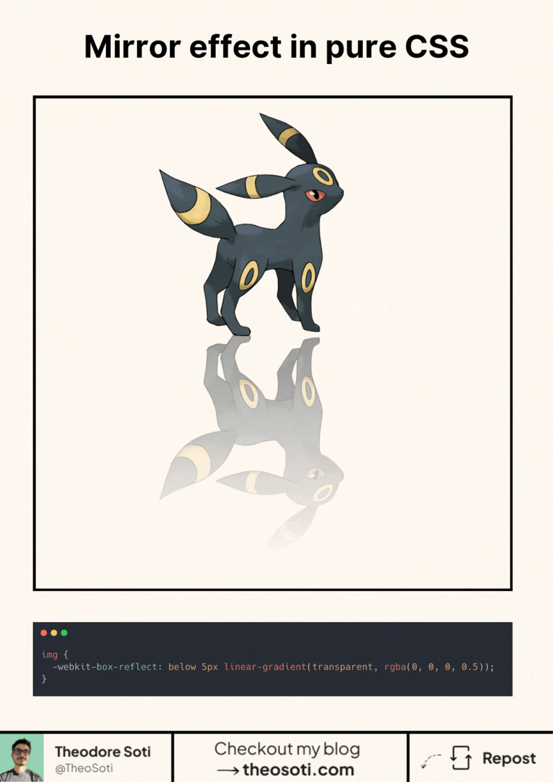
You can create a mirror reflection effect in CSS.
With one property.
No pseudo-elements. No duplicated images. No gradients hacks.
img {
	-webkit-box-reflect: below -5px linear-gradient(transparent, rgba(0, 0, 0, 0.5));
}
Here’s what’s happening:
-webkit-box-reflect does 3 things:
- below: puts the reflection under the element (you can also use above, left, right)
- -5px: the gap between the image and its reflection
- linear-gradient(…): fades the reflection out nicely
It looks great for:
- product shots
- hero images
- galleries
- “glass” / glossy UI vibes
⚠️ Small catch: it’s a WebKit-only feature. Works in Safari (and usually Chromium), but not Firefox.
Still, it’s a fun trick when you can use progressive enhancement.
box-reflect works best as a subtle accent instead of a full mirror. Keep the reflection short and softly faded, so the visual effect supports hierarchy without competing with the main content.
Here’s what’s happening:
` is most useful when you apply it with a narrow scope and a clear component-level objective. For this article, the strongest use case is straightforward: the technique is small, but the maintenance benefit grows when the team applies it with clear intent. Before shipping, keep this checklist in mind: keep fallback behavior explicit so unsupported environments remain stable. As always, test with real content and realistic viewport ranges; that is the fastest way to confirm the pattern holds up outside sandbox demos.
Here’s what’s happening:
` is intentional usage: one focused rule can often replace several brittle overrides. In this exact topic, the implementation payoff is clear: this is a good example of modern css reducing complexity while keeping behavior declarative. One thing worth validating early: document a short usage rule to keep future edits predictable. If you document this as a team convention, future refactors become easier because everyone understands when the technique should, and should not, be used.
box-reflect works best as a subtle visual accent on hero media or decorative cards. Keep reflections short and faded, so the effect supports hierarchy without stealing attention from primary content.
Validate it with real content and realistic viewport ranges so implementation details hold up outside demos.
If you liked this tip, you might enjoy the book, which is packed with similar insights to help you build better websites without relying on JavaScript.
Go check it out https://theosoti.com/you-dont-need-js/ and enjoy 20% OFF for a limited time!