Stop your content from being cut off by phone notches.
CSS safe area insets solve this problem easily.
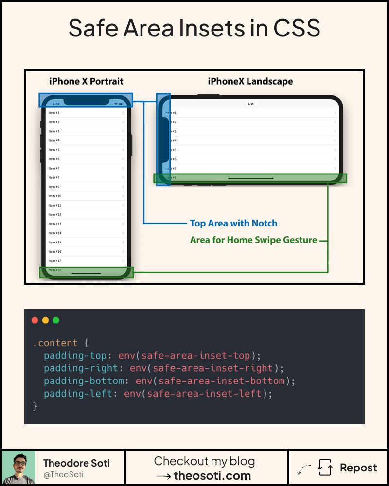
Today’s smartphones come with notches, rounded corners, and gesture bars.
If you’re not accounting for them, your content risks being clipped or hidden.
Enter CSS safe area insets with env().
They keep your UI visible and out of those unsafe zones.
With just a few lines:
padding-bottom: 48px;
padding-bottom: env(safe-area-inset-bottom);
- Your sticky navbar or bottom buttons stay tap-friendly
- Works automatically on devices with notches, rounded corners, or gesture bars
- Falls back gracefully on devices that don’t need it
The best part? This has a browser support of 96.78%!
In production, apply safe-area values only where needed, usually fixed headers, sticky footers, and full-screen overlays. Avoid adding every inset everywhere, or spacing can feel oversized.
A common pattern is combining a base padding with the environment value, for example padding-bottom: max(16px, env(safe-area-inset-bottom));. This preserves comfortable spacing on all devices.
Safe area insets are most important for fixed UI near device edges. Combine baseline spacing with env(safe-area-inset-*) so controls stay comfortable on both notched and non-notched screens.
Safe-area values matter most for fixed bars and edge-attached controls. Combine baseline spacing with env() insets to support both notched and non-notched devices.
Before rollout, verify long content, dense cards, and extreme widths. Stable behavior under stress is what turns a neat trick into production CSS.
If you liked this tip, you might enjoy the book, which is packed with similar insights to help you build better websites without relying on JavaScript.
Go check it out https://theosoti.com/you-dont-need-js/ and enjoy 20% OFF for a limited time!