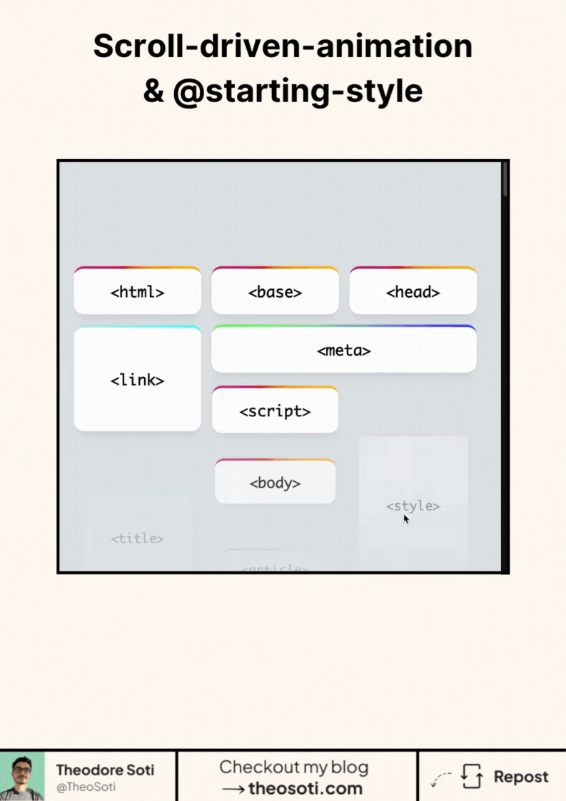
You can combine scroll-driven animations with @starting-style in CSS.
The goal is simple.
Fade elements in on page load.
Then animate them based on scroll.
At first glance, it sounds easy.
In practice, scroll timelines behave differently from classic animations.
So you need a small setup.
Register a custom property
Instead of animating opacity directly,
animate a numeric value you control.
@property --progress {
	syntax: '<number>';
	inherits: false;
	initial-value: 0;
}
This gives you a stable value to work with.
Define the entry state
Use @starting-style to handle the initial fade-in.
@starting-style {
	opacity: 0;
}
Now the browser knows the element’s starting point,
even if it appears dynamically.
Drive the animation with scroll
Animate the custom property using a scroll timeline.
animation: progress linear both;
animation-timeline: view();
Then map it back to real styles.
opacity: var(--progress);That’s the pattern.
Smooth entry animation.
Scroll-linked motion.
No hacks.
No JavaScript.
Just modern CSS doing modern UI work.
This kind of setup shows how far CSS has evolved.
And how much interaction it can handle on its own.
Have you started experimenting with scroll-driven animations yet?!
Scroll-driven animations should reinforce context, not distract from content. Keep progress-linked motion restrained and provide comfortable fallbacks for reduced-motion users.
Run interaction tests with rapid clicks and navigation changes. Input should stay responsive even while transitions are active.
A practical way to adopt @starting-style is to scope it to one high-impact component first. This keeps implementation predictable and prevents style drift as the codebase grows.
If you liked this tip, you might enjoy the book, which is packed with similar insights to help you build better websites without relying on JavaScript.
Go check it out https://theosoti.com/you-dont-need-js/ and enjoy 20% OFF for a limited time!