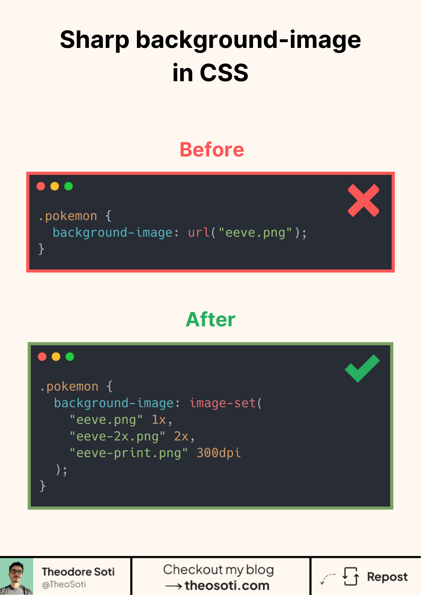
Serve sharp backgrounds without extra code.
Let the browser pick the right asset.
image-set() is like srcset, but for CSS.
You give multiple sources. The browser chooses the best one for the screen.
Why use it:
- Retina screens get crisp images.
- Regular screens download smaller files.
- No JavaScript. No hacks.
It also works in other image-accepting properties like content, list-style-image, and border-image(but with less browser support).
Using image-set() in a background-image property has almost 96% browser support!
Practical tips:
- Add a plain fallback first for older browsers:
background-image: url("evee.png");then theimage-set(). - Keep file names consistent (@1x, @2x) to simplify builds.
- Pair with background-size: cover/contain as needed.
- Test AVIF/WEBP plus JPEG/PNG as a safe fallback.
image-set() helps serve crisp backgrounds on high-density screens without always downloading the heaviest asset. Add sensible fallbacks so lower-density devices still render quickly and clearly.
image-set() helps deliver sharper backgrounds on high-density displays without always forcing large assets. Keep sensible fallbacks to protect load performance.
Keep fallback rendering in mind so unsupported effects still produce clear, readable visuals.
A practical way to adopt image-set() is to scope it to one high-impact component first. After validation, expand gradually to matching components and avoid ad-hoc one-off overrides.
Pair image-set() with explicit background-size rules so high-density assets remain sharp without unexpected cropping.
Want to build modern interfaces with less JavaScript?
I wrote a guide about building modern UI with HTML and CSS first. It covers practical patterns you can use before reaching for JavaScript.
Learn more