Did you know you can create a column layout without grid or flex?
It only takes 2 lines of CSS and can be useful!
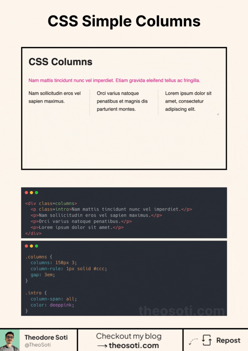
One key advantage is the ability to easily add separators between columns.
So how to implement it?
Apply the columns property to your container. This property accepts up to two values:
- The minimum width of a column (not mandatory)
- The number of desired columns (mandatory)
And just with that it works!
But you can go further by:
- Using the
gapproperty to create spacing between columns. - Adding separator with the “column-rule” property (it works just like
border). - Make an element span across all columns with the
column-spanproperty.
Don’t hesitate to use it in your next project!
CSS columns are effective for flowing long-form text with minimal setup. Tune column width and gaps carefully, because readability depends on line length as much as layout density.
CSS columns are quick for flowing long-form text and lightweight galleries. Tune width and gaps carefully, because readability depends strongly on line length.
Use this pattern to keep responsive behavior local to the component instead of scattering viewport overrides. That makes scaling and refactoring much safer.
To roll this out safely, start by applying column-span in a single UI surface where the benefit is obvious. Then reuse that same pattern in similar contexts so behavior stays consistent and review time stays low.
Before shipping, test column-span with both short and long content, then verify behavior in narrow and wide containers.
If you liked this tip, you might enjoy the book, which is packed with similar insights to help you build better websites without relying on JavaScript.
Go check it out https://theosoti.com/you-dont-need-js/ and enjoy 20% OFF for a limited time!