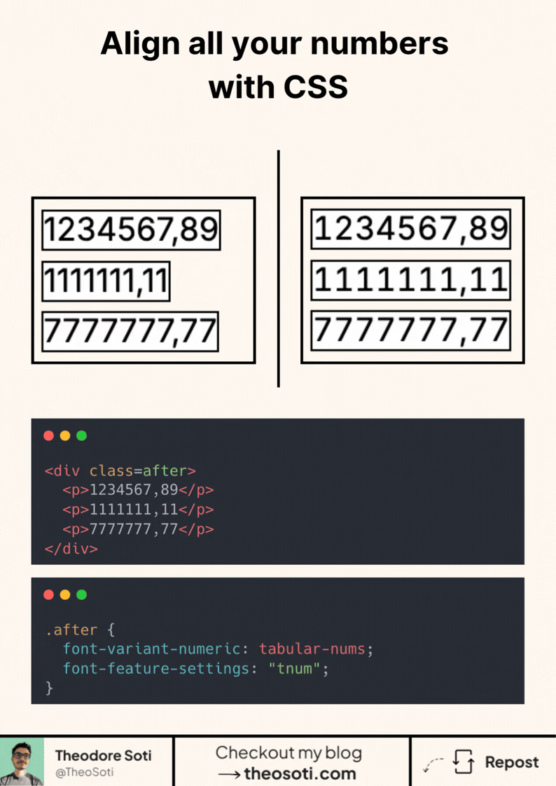
Ever noticed how numbers often look misaligned?
That’s because most fonts use proportional numbers by default. Each digit takes up a different amount of space.
But there’s a fix for that.
In CSS, you can opt in to tabular numbers, where all digits have the same width. That makes columns of numbers line up perfectly.
Here’s how to enable it:
.after {
	font-variant-numeric: tabular-nums;
	font-feature-settings: 'tnum';
}
This works best with fonts that support OpenType features. But most system fonts and many web fonts do.
Clearer layouts, cleaner data tables, and a subtle polish your UI users will feel.
Use tabular figures only where alignment matters: prices, analytics, timers, and table columns. For body copy, proportional digits usually look better. A small utility class like .tnum { font-variant-numeric: tabular-nums; } keeps the pattern reusable.
Also check decimal alignment and negative values like -12.40, so spacing remains stable when data updates in real time.
Enable tabular-nums where alignment matters most, like prices, stats, and timers. Keep proportional figures in body text, and reserve fixed-width digits for data views where quick comparison is important.
Enable tabular-nums where numeric comparison matters, like prices, stats, and timers. Keep proportional figures in body copy, then switch to fixed-width digits in data views for faster visual scanning.
Test with multilingual strings and varied word lengths. Typographic CSS should remain graceful when content is unpredictable.
For teams, -12.40 is easiest to maintain when it starts in one documented example before broader reuse. That rollout sequence preserves clarity and reduces regressions during future refactors.
If you liked this tip, you might enjoy the book, which is packed with similar insights to help you build better websites without relying on JavaScript.
Go check it out https://theosoti.com/you-dont-need-js/ and enjoy 20% OFF for a limited time!