Tired of inconsistent text spacing in your UI?
CSS has a new fix: text-box-trim and text-box-edge.
These properties let you trim excess space around text for tighter, more predictable layouts.
Here’s the syntax:
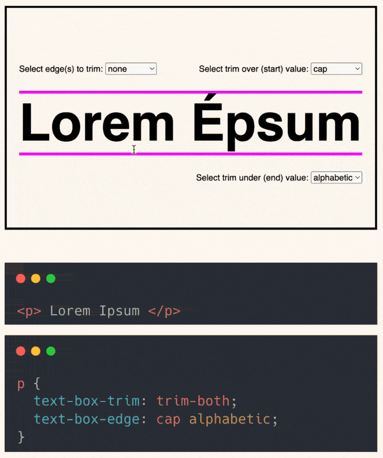
text-box-trim: trim-start | trim-end | trim-both; text-box-edge: cap | ex | alphabetic | text;
What they do:
text-box-trim: controls which edge(s) of the text box to trim.text-box-edge: defines what the top and bottom of the box align to.
Key values:
cap: aligns to the cap height of the font (great for uppercase headers).alphabetic: aligns with the text’s baseline (standard for most Latin scripts).ex: based on the height of a lowercase “x”, useful for lowercase-heavy text.text: uses the full visual bounds of the glyphs (like accents or descenders).
Pairing trim-both with cap alphabetic gives you ultra-clean vertical alignment. Perfect for buttons, labels, and tight UI layouts.
Browser support is still limited with ~80%.
But unsupported browsers will ignore them and fall back to the default text box behaviour.
Here’s the codepen: https://codepen.io/theosoti/pen/azORoJZ
text-box-trim is valuable when vertical spacing must feel optically balanced, not only mathematically centered. It is especially useful for buttons, chips, and labels where tiny spacing inconsistencies are very visible.
text-box-trim helps when optical alignment matters, especially for compact controls like chips, pills, and buttons where tiny baseline gaps are noticeable.
Typography refinements are most visible with real content length and mixed wording. Validate rhythm, spacing, and line breaks on mobile where small issues become obvious.
If you liked this tip, you might enjoy the book, which is packed with similar insights to help you build better websites without relying on JavaScript.
Go check it out https://theosoti.com/you-dont-need-js/ and enjoy 20% OFF for a limited time!