You probably know text-decoration: underline;.
But do you know what else it can do?
Most developers stop at text-decoration: underline; But CSS has a whole toolbox of styling options hiding in plain sight.
Here are some underrated text-decoration properties you can be using:
-
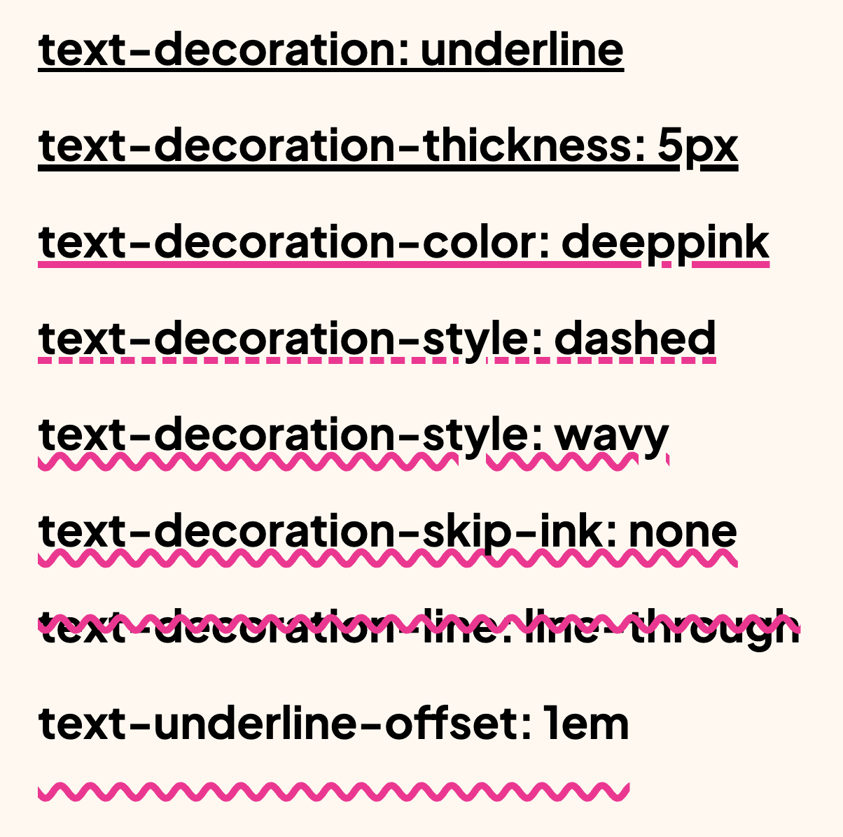
text-decoration-thickness: 5px; Control the thickness of the line
-
text-decoration-color: deeppink; Change the line’s color (it can be animated independently of the text’s color)
-
text-decoration-style: solid | dashed | wavy; Customize the line’s appearance
-
text-decoration-skip-ink: auto | none; Decide whether the line should skip descenders (like g/j/y)
-
text-decoration-line: underline | overline | line-through; Choose the position(s), or combine them
-
text-underline-offset: 1em; Offset the line for better spacing and clarity
Perfect for giving your typography more control and visual polish.
Bonus: it’s supported in all browsers.
Fine-tuning underline thickness, offset, and skip behavior improves legibility in dense text. This is especially useful for links inside paragraph content where default underlines can feel too heavy or too close to glyphs.
Underline controls can significantly improve link readability in dense text. Adjust thickness and offset to keep links clear without colliding with glyph descenders.
Test with multilingual strings and varied word lengths. Typographic CSS should remain graceful when content is unpredictable.
When introducing text-decoration: underline;, begin with one reference component and treat it as the canonical pattern. Then reuse that same pattern in similar contexts so behavior stays consistent and review time stays low.
If you liked this tip, you might enjoy the book, which is packed with similar insights to help you build better websites without relying on JavaScript.
Go check it out https://theosoti.com/you-dont-need-js/ and enjoy 20% OFF for a limited time!