Make your text type itself. With pure CSS.
How it works
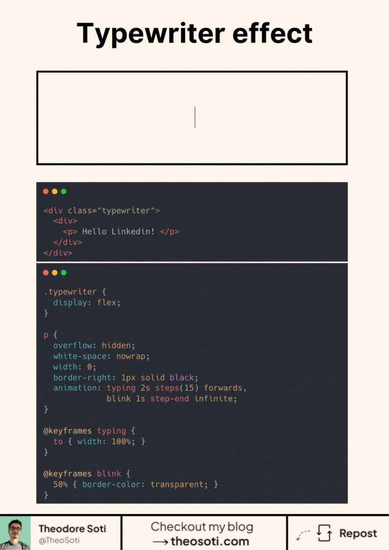
- overflow: hidden hides the unrevealed text.
- white-space: nowrap keeps everything on one line.
- Animate width from 0 to 100% with @keyframes typing.
- Use steps(n) to reveal characters one by one. Set n close to the character count for a crisp tick.
- A 1px border-right acts as the caret. A second animation toggles its color to “blink”.
- Add animation-fill-mode: forwards so the text stays visible at the end.
Practical tips
- Prefer a monospace font for perfectly even steps, or tune the steps() value if letters have different widths.
- If the string changes, update the steps() count.
- Respect users with @media (prefers-reduced-motion: reduce) to disable or simplify the effect.
The best part? It’s supported by almost 96% of browsers!
Would you use this in a hero, headline, or code sample?
A CSS typing effect works best for short phrases and compact hero copy. Keep timing consistent and provide immediate readable text when motion is reduced or unsupported.
Typing effects are strongest on short, high-impact lines. Keep timing tight and provide immediate readable fallback when motion preferences disable animation.
Typography refinements are most visible with real content length and mixed wording. Validate rhythm, spacing, and line breaks on mobile where small issues become obvious.
When introducing typing animation, begin with one reference component and treat it as the canonical pattern. This keeps implementation predictable and prevents style drift as the codebase grows.
If you liked this tip, you might enjoy the book, which is packed with similar insights to help you build better websites without relying on JavaScript.
Go check it out https://theosoti.com/you-dont-need-js/ and enjoy 20% OFF for a limited time!