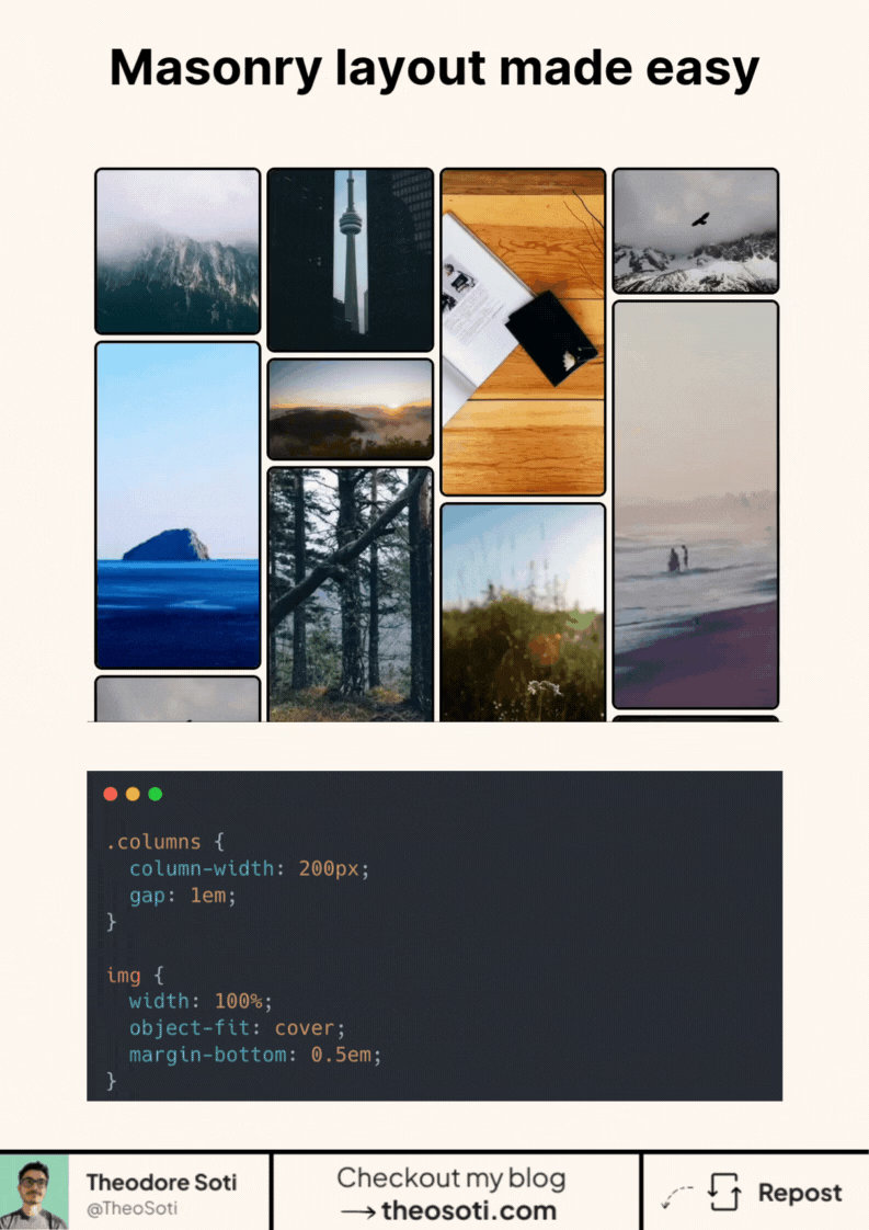
You only need a few CSS lines to build a Masonry layout.
Here’s how it works: The magic happens with the column-width property.
.columns {
	width: 100%;
	column-width: 200px;
	gap: 1em;
}
This tells the browser: “Fit as many 200px-wide columns as you can into this container.”
If the screen is wider, more columns fit. On smaller screens, fewer columns show.
The gap sets the horizontal spacing between them.
The rest is just good styling:
- Images set to width: 100% so they fill the column
- object-fit: cover to keep them visually balanced
- A bit of padding, rounded corners, and borders for aesthetics
No position hacks. No flex/grid juggling. Just native CSS doing the heavy lifting.
And it adapts instantly when you resize the container.
Link to the codepen: https://codepen.io/theosoti/pen/ogXedrz
Column-based masonry layouts are fast to implement for feeds and galleries. Always test reading flow and item ordering, because visual columns can differ from the underlying DOM sequence users navigate.
Column-based masonry is quick for feeds, but always verify reading order and keyboard navigation. Visual placement should not conflict with logical DOM sequence.
Before rollout, verify long content, dense cards, and extreme widths. Stable behavior under stress is what turns a neat trick into production CSS.
When introducing column-width, begin with one reference component and treat it as the canonical pattern. Then reuse that same pattern in similar contexts so behavior stays consistent and review time stays low.
If reading order matters, double-check keyboard and screen-reader flow so visual columns do not confuse content sequence.
If you liked this tip, you might enjoy the book, which is packed with similar insights to help you build better websites without relying on JavaScript.
Go check it out https://theosoti.com/you-dont-need-js/ and enjoy 20% OFF for a limited time!