The native <dialog> element is more capable than you think.
It’s not a new element, but it’s often overlooked in favor of custom modal components.
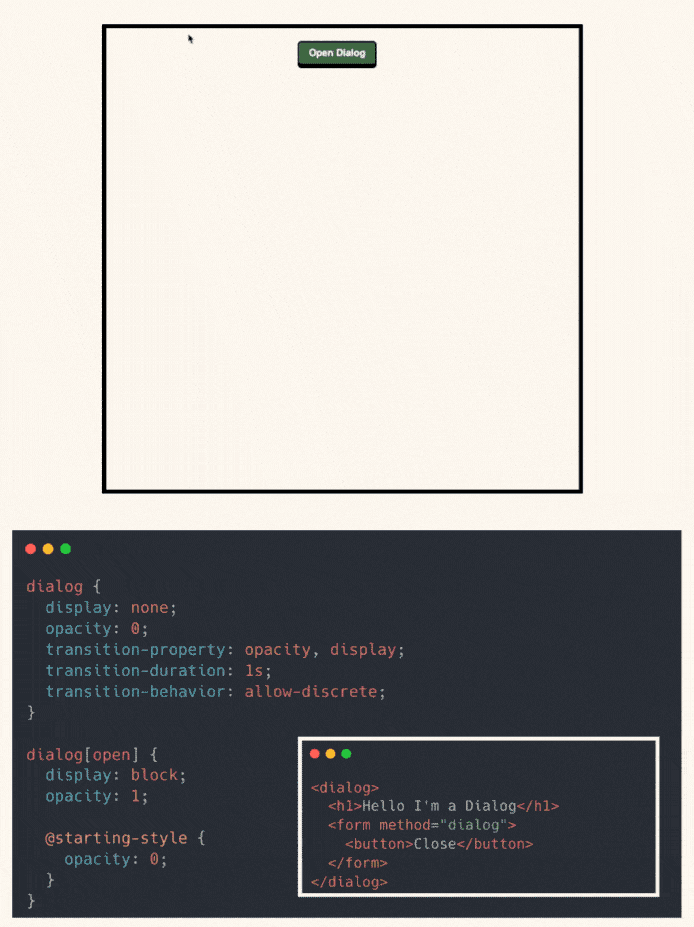
Yet it handles a lot out of the box:
- Built-in open/close API (.showModal() and method=“dialog”)
- Automatically traps focus for accessibility
- Keyboard support (like closing on Escape)
- Native backdrop with the ::backdrop pseudo-element
- Easily stylable with modern CSS
- Supports transitions with @starting-style and transition-behavior: allow-discrete
If you’ve been building modal systems from scratch, the native dialog might deserve a second look.
It’s simple, accessible, and works with the tools you already use.
Have you used <dialog> in production?
Here’s the codepen: https://codepen.io/theosoti/pen/WbvJXvZ
The native <dialog> element simplifies focus management and modality with far less custom code. Keep close actions explicit and labels clear, then style ::backdrop to reinforce context without reducing contrast.
The native <dialog> element reduces custom modal plumbing while preserving expected keyboard behavior. Clear close actions and accessible labels remain essential for usability.
Check autofill, mobile keyboards, and error feedback before shipping. These practical states reveal more than static demos and keep the form experience trustworthy.
To roll this out safely, start by applying ::backdrop in a single UI surface where the benefit is obvious. After validation, expand gradually to matching components and avoid ad-hoc one-off overrides.
If you liked this tip, you might enjoy the book, which is packed with similar insights to help you build better websites without relying on JavaScript.
Go check it out https://theosoti.com/you-dont-need-js/ and enjoy 20% OFF for a limited time!