Tired of blue checkboxes that don’t match your brand?
Now you can fix that in one line of CSS.
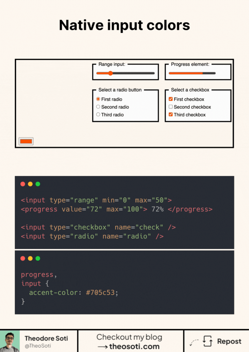
Native form elements are finally catching up. You can now change the color of checkboxes, radios, range sliders, and even progress bars. Without JavaScript, wrappers, or hacks.
It’s as simple as:
input,
progress {
  accent-color: red;
}
Why this matters:
- Matches your brand identity down to the smallest details
- Works on all common input types, no need for custom components
- Keeps the native behavior and accessibility intact
It’s supported in all major browsers (even mobile!) with 94,6%.
So if you’re still using SVG icons or replacing inputs with divs just to match a color, you can stop now.
accent-color gives quick brand alignment for native controls with almost no overhead. Treat it as a polish layer and still verify contrast, focus visibility, and disabled states across form components.
accent-color is a fast way to align native controls with brand tone while keeping semantics intact. Treat it as polish, and still verify contrast and focus clarity across states.
On form-heavy pages, this is most effective when you keep semantics native and style enhancements lightweight. That balance preserves accessibility and reduces maintenance cost.
When introducing accent-color, begin with one reference component and treat it as the canonical pattern. That rollout sequence preserves clarity and reduces regressions during future refactors.
As a final check, run accent-color through edge cases like dense layouts, long labels, and constrained mobile widths.
If you liked this tip, you might enjoy the book, which is packed with similar insights to help you build better websites without relying on JavaScript.
Go check it out https://theosoti.com/you-dont-need-js/ and enjoy 20% OFF for a limited time!