Media queries aren’t the only solution for responsive design.
But the syntax can now be cleaner and easier to read.
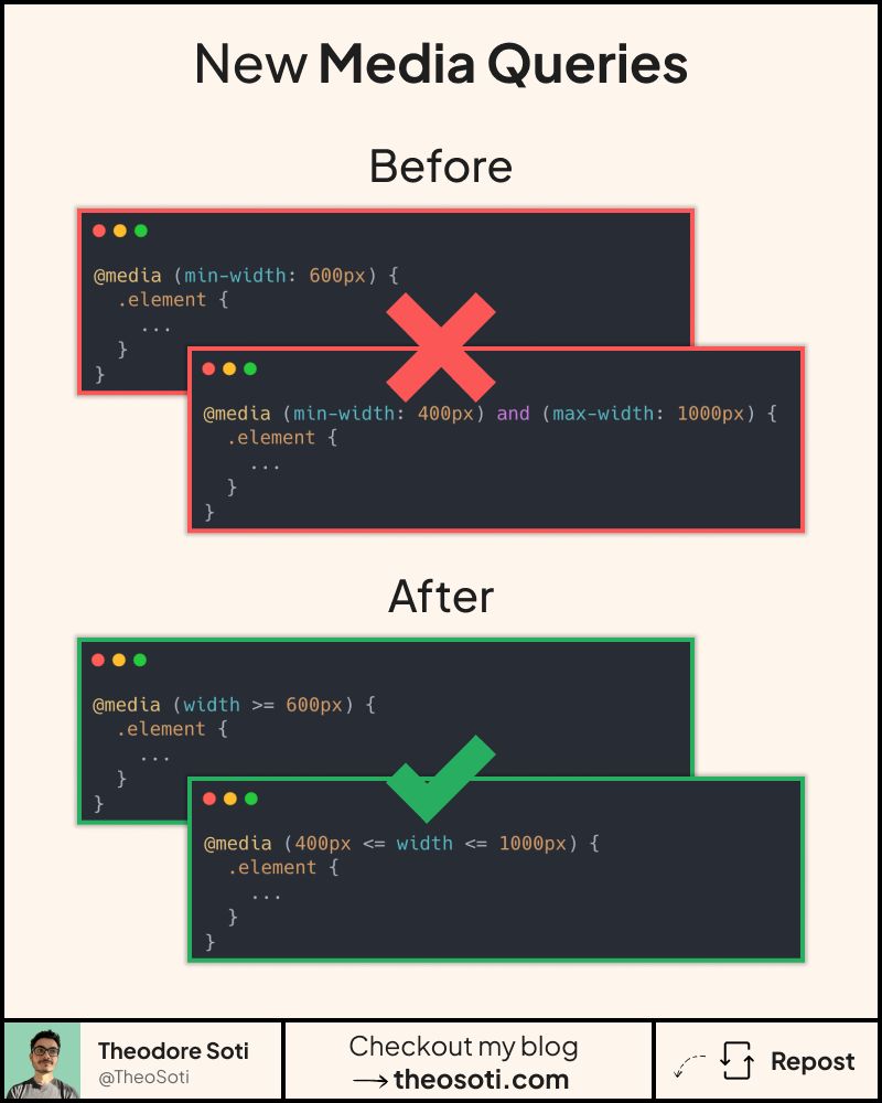
You can use range operators directly in media queries.
That means >=, <=, >, and < logic in a natural order.
Before this syntax, we often wrote long rules with min-width and max-width.
They worked, but they were harder to scan.
Now you can express the same condition in a shorter way.
For example, @media (width >= 48rem) reads almost like plain language.
You can also combine ranges in one condition.
That makes breakpoint rules easier to reason about during reviews.
The biggest gain is readability. When a file has many responsive conditions, simple syntax reduces mistakes. You spend less time decoding selectors and more time checking behavior.
Range media queries are easier to read and reduce breakpoint logic mistakes. Standardize unit choice and naming conventions so responsive rules stay clear during team reviews.
Range media queries improve readability and reduce breakpoint logic errors. Keep units and naming conventions consistent so responsive rules remain easy to review.
This pattern has the best payoff when documented with one clear usage rule. Consistent adoption turns small CSS features into reliable system behavior.
A practical way to adopt min-width is to scope it to one high-impact component first. Then reuse that same pattern in similar contexts so behavior stays consistent and review time stays low.
Keeping breakpoint ranges non-overlapping makes cascade behavior easier to reason about and prevents hard-to-debug edge widths.
If you liked this tip, you might enjoy the book, which is packed with similar insights to help you build better websites without relying on JavaScript.
Go check it out https://theosoti.com/you-dont-need-js/ and enjoy 20% OFF for a limited time!