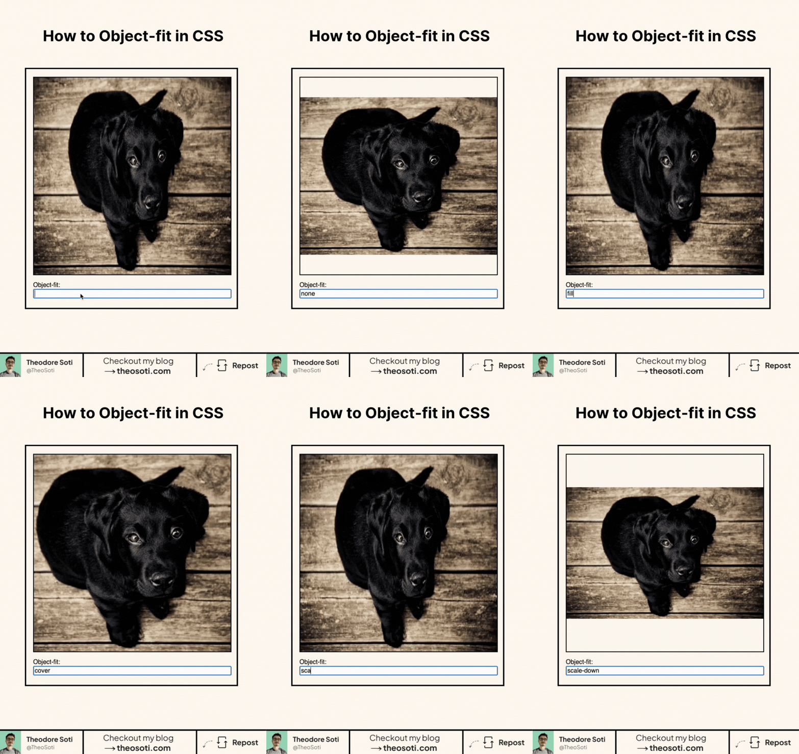
Master object-fit in under one minute.
Images and videos do not always scale the way you want inside a fixed-size box. That is what object-fit controls.
.media {
	inline-size: 20rem;
	block-size: 12rem;
	object-fit: cover;
}
There are five values:
fillstretches the media to fill the box, even when that changes its aspect ratio.containshows the whole media without cropping, which may leave empty space.coverfills the box while preserving the aspect ratio, so some content may be cropped.nonekeeps the media at its natural size.scale-downchooses whichever result is smaller betweennoneandcontain.
The element needs a constrained content box before the differences become visible. Pair object-fit with an explicit inline size, block size, or aspect-ratio.
I use object-fit: cover most often for cards and thumbnails, where filling the frame matters more than showing every edge of the image.
If you liked this tip, you might enjoy my guide “You Don’t Need JavaScript”, which contains more ways to build modern interfaces with HTML and CSS.
You can find it at https://theosoti.com/you-dont-need-js/.