Smarter sizing with just one CSS function.
Let your content define the layout… dynamically. You can now use calc-size() to compute size values based on both layout constraints and live attributes. Why is that a big deal?
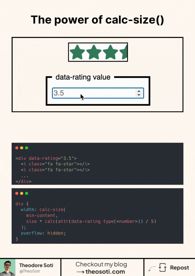
Because it makes things like this rating system possible with:
- No JS
- No inline styles
- No custom properties
Just pure CSS, reacting to attributes like data-rating. The calc-size() function is a new addition to CSS.
It allows you to perform calculations using intrinsic size values like auto, min-content, max-content, or fit-content.
These values aren’t supported in regular calc(), which makes calc-size() a powerful new tool. You can also use this function to animate an element’s height to auto!
It’s powerful, it’s expressive, and it unlocks a new level of flexibility for dynamic UI design.
Here’s the codepen link: https://codepen.io/theosoti/pen/gbOVBVp
calc-size() is useful when component dimensions should adapt without JS measurement loops. It works well for controls and rating UIs where content-driven sizing still needs predictable limits.
calc-size() helps combine content-driven sizing with fixed constraints. It is useful when UI parts should flex naturally but still remain within intentional layout bounds.
This pattern has the best payoff when documented with one clear usage rule. Consistent adoption turns small CSS features into reliable system behavior.
When introducing calc-size(), begin with one reference component and treat it as the canonical pattern. This keeps implementation predictable and prevents style drift as the codebase grows.
If you liked this tip, you might enjoy the book, which is packed with similar insights to help you build better websites without relying on JavaScript.
Go check it out https://theosoti.com/you-dont-need-js/ and enjoy 20% OFF for a limited time!