Did you know CSS has a hidden gem called display: contents?
It’s a powerful tool that helps simplify layouts without adding extra DOM elements. It removes an element from the layout while keeping its children intact.
Why is this so powerful?
- It lets you restructure layouts without adding extra wrappers.
- It works seamlessly with Flexbox and Grid, making designs more flexible.
- It pairs perfectly with order to rearrange content without duplication.
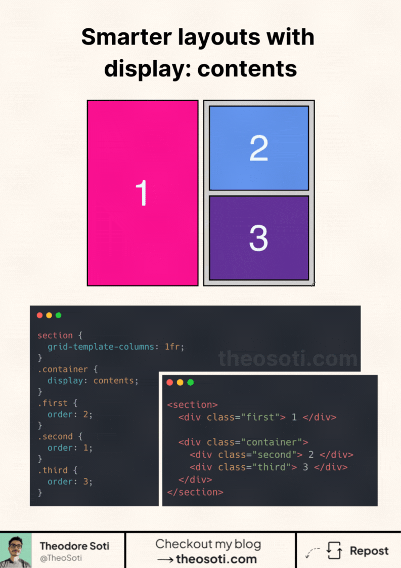
On desktop, blocks 2 and 3 sit next to block 1 inside a container. On mobile, block 2 moves above block 1, and block 3 drops below it.
Normally, this would require workarounds: extra markup, hacks, or even duplicated content.
With display: contents, it’s just one line of CSS.
Browser support is already at 97%! But be aware, this property has some accessibility issues, especially with screen readers.
<section>
  <div class="first"></div>

  <div class="container">
    <div class="second"></div>
    <div class="third"></div>
  </div>
</section>
section {
grid-template-columns: 1fr;
}
.container {
display: contents;
}
.first {
order: 2;
}
.second {
order: 1;
}
.third {
order: 3;
}Full code available here: https://codepen.io/theosoti/pen/KwPZGQQ
display: contents can simplify wrapper-heavy markup in layout contexts, but semantics still matter. Verify accessibility tree behavior for interactive and labeled content before broad adoption.
Selector-driven improvements scale best when specificity remains controlled. Keep targeting rules readable so future edits do not become cascade puzzles.
To roll this out safely, start by applying display: contents in a single UI surface where the benefit is obvious. That rollout sequence preserves clarity and reduces regressions during future refactors.
Use display: contents selectively on structural wrappers, and keep semantic elements intact when labels or landmarks are required.
If you liked this tip, you might enjoy the book, which is packed with similar insights to help you build better websites without relying on JavaScript.
Go check it out https://theosoti.com/you-dont-need-js/ and enjoy 20% OFF for a limited time!