Smooth scrolling makes navigation feel effortless.
When users click an anchor link, the browser jumps abruptly to the section. This can be jarring, especially on long pages.
Instead of relying on JavaScript for smooth scrolling, CSS has a built-in solution: “scroll-behavior: smooth”.
With just this, your page transitions fluidly between sections.
But what if the content feels too close to the edge?
By default, scrolling stops at the very top of the section, sometimes cutting off important content.
Fix this with scroll-padding or scroll-margin: scroll-margin-top: 20px;
Now, every scroll lands in a comfortable, readable position.
It’s lightweight, easy to implement, and widely supported (more than 95,5%).
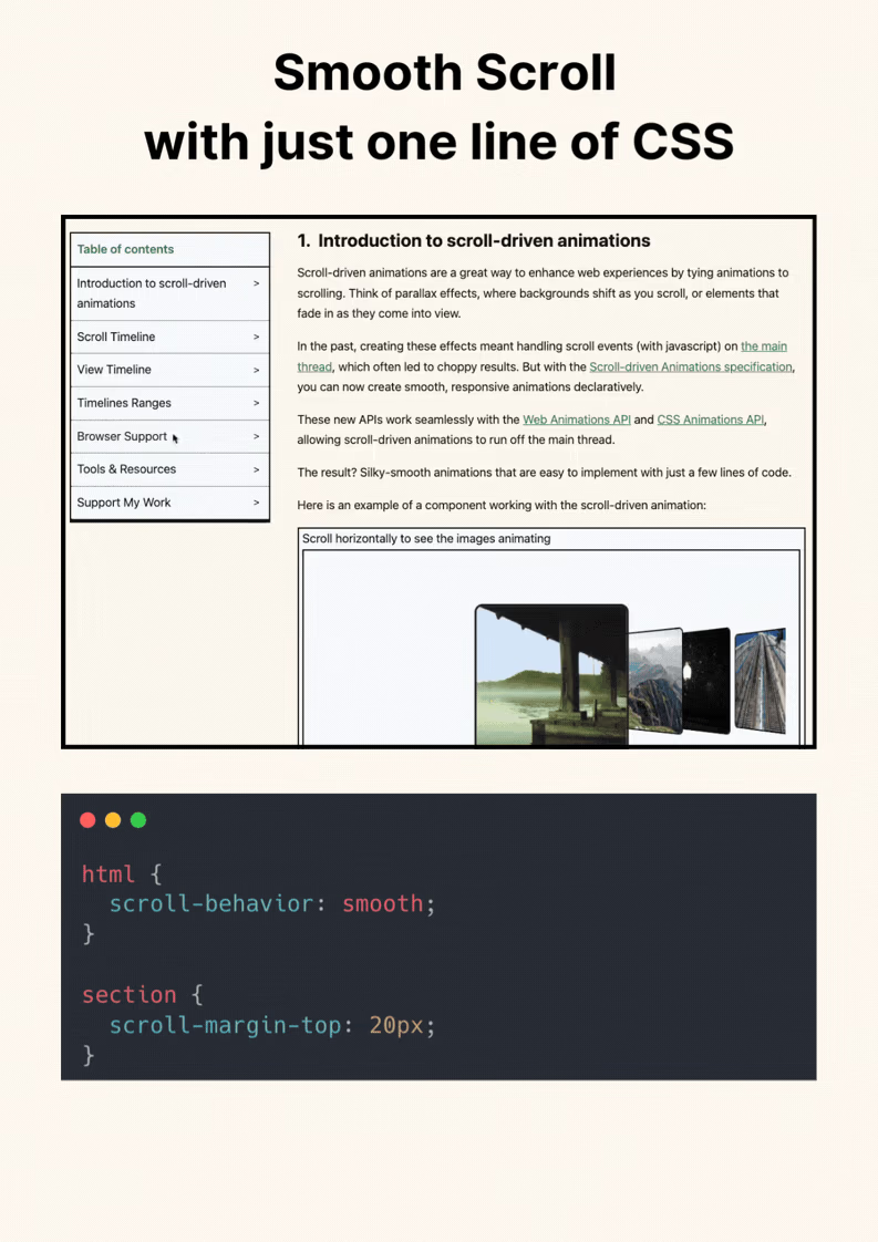
html {
	scroll-behaviour: smooth;
}

section {
	scroll-margin-top: 20px;
}
Smooth anchor navigation feels best when paired with scroll-margin-top on headings, especially under sticky headers. Also account for reduced-motion preferences so users who disable motion still get direct navigation.
Smooth anchor navigation is strongest when paired with heading offsets. Combine scroll-behavior with scroll-margin-top so anchors land cleanly under sticky headers.
Run interaction tests with rapid clicks and navigation changes. Input should stay responsive even while transitions are active.
To roll this out safely, start by applying scroll-padding in a single UI surface where the benefit is obvious. After validation, expand gradually to matching components and avoid ad-hoc one-off overrides.
Before shipping, test scroll-padding with both short and long content, then verify behavior in narrow and wide containers.
If you liked this tip, you might enjoy the book, which is packed with similar insights to help you build better websites without relying on JavaScript.
Go check it out https://theosoti.com/you-dont-need-js/ and enjoy 20% OFF for a limited time!