Make your text pop with a single CSS trick.
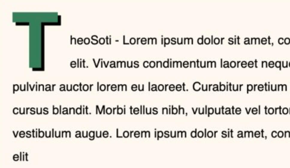
Ever noticed those stylish drop caps in print media? You can achieve the same effect in CSS easily.
The magic? Just two lines of CSS:
p:first-letter {
  initial-letter: 3 2;
}- :first-letter targets the first character of a paragraph.
- initial-letter: 3 2; pushes text aside by two lines, creating a balanced look
This is perfect for giving articles, blogs, or long-form content a more refined and readable look.
Browser support is great for :first-letter with more than 97,5%.
For initial-letter it’s good but not great with more than 91%.
Full code available here: https://codepen.io/theosoti/pen/PwoaJNP
For robust typography, combine initial-letter with a visual fallback using float, line-height, and margin. Browsers that support initial-letter get the ideal layout, while others still show a clean decorative first letter.
Keep accessibility in mind: large ornate drop caps can hurt readability on narrow screens. Reduce the size on mobile and verify line wrapping with short and long first words.
Drop caps look better when size, line-height, and paragraph spacing are tuned together. Keep the effect moderate on small screens so decorative typography adds tone without hurting reading flow.
Drop caps work best when size, spacing, and line-height are tuned together. Keep the effect restrained on mobile so decorative typography does not disrupt reading flow.
Typography refinements are most visible with real content length and mixed wording. Validate rhythm, spacing, and line breaks on mobile where small issues become obvious.
If you liked this tip, you might enjoy the book, which is packed with similar insights to help you build better websites without relying on JavaScript.
Go check it out https://theosoti.com/you-dont-need-js/ and enjoy 20% OFF for a limited time!