The tiny JavaScript we keep writing
A lot of frontend JavaScript is not really application logic.
Sometimes it is just glue.
You have a button.
You have a dialog.
When the button is clicked, the dialog should open.
So you write this:
const button = document.querySelector('.open-dialog');
const dialog = document.querySelector('#confirm-dialog');

button.addEventListener('click', () => {
	dialog.showModal();
});
There is nothing wrong with this code. It is clear, small, and easy to understand.
But it also feels strange.
The browser already knows what a button is.
The browser already knows what a dialog is.
The browser already knows how to open a modal dialog.
The only missing piece is the connection between the two.
That is the gap command and commandfor fill.
They let you describe the relationship directly in HTML:
<button command="show-modal" commandfor="confirm-dialog">Delete project</button>

<dialog id="confirm-dialog">
	<p class="dialog-title">Delete this project?</p>
	<p>This action cannot be undone.</p>

	<button command="close" commandfor="confirm-dialog">Cancel</button>
</dialog>
No click listener.
No querySelector.
No tiny state wrapper just to call a native method.
The button says what it controls, and what action it wants to perform.
The mental model: a button can invoke a native action
commandfor is the connection.
It points to the id of the element you want to control:
<button commandfor="confirm-dialog"></button>command is the action:
<button command="show-modal"></button>Put them together and the button becomes an invoker. It can ask a supported element to do something the browser already understands.
For dialogs, that can be:
<button command="show-modal" commandfor="confirm-dialog">Open dialog</button>

<button command="close" commandfor="confirm-dialog">Close dialog</button>
For popovers, that can be:
<button command="toggle-popover" commandfor="menu">Toggle menu</button>

<div id="menu" popover>
	<a href="/account">Account</a>
	<a href="/settings">Settings</a>
</div>
This is not a replacement for all JavaScript.
It is a replacement for the boring JavaScript that only exists to connect a button to a native browser behavior.
That distinction matters. If your modal needs to fetch data, update app state, track events, or coordinate a complex workflow, JavaScript still belongs there. But if your code only says “open this dialog” or “toggle this popover”, HTML can now carry that intent by itself.
Dialog
Popover
Open a dialog without JavaScript
Native <dialog> already gives you a lot:
- modal behavior with
showModal() - focus handling
- Escape key behavior
- a
::backdrop - form-friendly close actions
Before commandfor, opening the dialog still usually needed a small script:
openButton.addEventListener('click', () => {
	dialog.showModal();
});
Now the open button can call the native action by itself:
<button type="button" command="show-modal" commandfor="newsletter-dialog">Open newsletter settings</button>

<dialog id="newsletter-dialog" aria-labelledby="newsletter-title">
	<p id="newsletter-title" class="dialog-title">Newsletter settings</p>
	<p>Choose how often you want to hear from us.</p>

	<button type="button" command="close" commandfor="newsletter-dialog">Close</button>
</dialog>
The important part is this:
command="show-modal" commandfor="newsletter-dialog"show-modal is the declarative equivalent of calling dialog.showModal().
close is the declarative equivalent of calling dialog.close().
There is also request-close, which is closer to asking the dialog to close. It fires the cancel flow first, so code can prevent the close if needed. For simple demos, close is easier to understand. For serious confirmation flows, request-close can be a better fit.
Control a popover without JavaScript
Popover already had a declarative trigger:
<button popovertarget="menu">Toggle menu</button>

<div id="menu" popover>Menu content</div>
That still works.
The difference is that command and commandfor are more general. They are not only for popovers.
Here is the same menu with the new pattern:
<button type="button" command="toggle-popover" commandfor="profile-menu">Account</button>

<nav id="profile-menu" popover>
	<a href="/profile">Profile</a>
	<a href="/settings">Settings</a>
	<button type="button" command="hide-popover" commandfor="profile-menu">Close</button>
</nav>
You can use:
show-popoverhide-popovertoggle-popover
So the button can be explicit about what it does. A trigger button can toggle. A close button inside the popover can hide. A separate help button could only show.
The nice part is that the browser still handles the native popover behavior. Auto popovers can light-dismiss. They can close with Escape. They live in the top layer instead of fighting the rest of your stacking context.
If you want a deeper intro to the Popover API, I already wrote about native HTML popovers. This article is about the newer control layer on top.
commandfor only handles the action. If the popover also needs to stay attached to its trigger, CSS Anchor Positioning handles the placement. To animate a dialog or popover as it enters the top layer, you can add an @starting-style entry transition without changing the HTML that opens it.
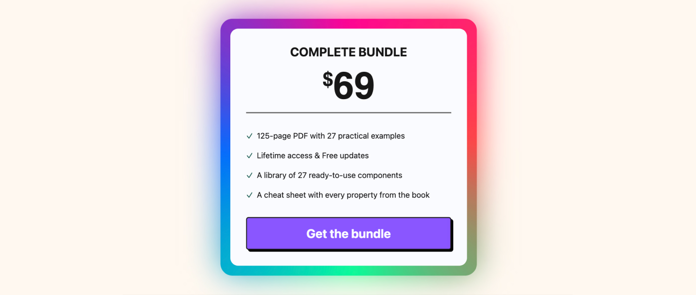
Want to build modern interfaces with less JavaScript?
I wrote a guide about building modern UI with HTML and CSS first. It covers practical patterns you can use before reaching for JavaScript.
Learn moreYou do not need to rewrite every popover just because commandfor exists.
The older popovertarget syntax is still short and readable:
<button popovertarget="menu">Menu</button>For a simple popover trigger, that is perfectly fine.
commandfor becomes more interesting when you want one mental model for different native actions:
<!-- Dialog -->
<button command="show-modal" commandfor="confirm-dialog">Open dialog</button>

<!-- Popover -->
<button command="toggle-popover" commandfor="profile-menu">Toggle menu</button>
If all you need is a popover toggle, use the syntax your team finds clearer. If you are building a design system and want one declarative pattern for dialogs and popovers, commandfor is easier to standardize.
Browser support
This is the part you should not skip.
command and commandfor are Baseline 2025 features.
Support starts in Chrome and Edge 135, Firefox 144, and Safari/iOS Safari 26.2. Older browsers do not support them.
That makes it reasonable for progressive enhancement, but you still need to think about the importance of the interaction.
If a popover is just extra help text, unsupported browsers can miss the enhancement. If a modal is the only way to complete a critical checkout step, you need a fallback.
The simplest fallback is still a tiny script:
if (!('command' in HTMLButtonElement.prototype)) {
	document.querySelectorAll('[command][commandfor]').forEach((button) => {
		const target = document.getElementById(button.getAttribute('commandfor'));
		const command = button.getAttribute('command');

		button.addEventListener('click', () => {
			if (command === 'show-modal') target?.showModal?.();
			if (command === 'close') target?.close?.();
			if (command === 'toggle-popover') target?.togglePopover?.();
			if (command === 'show-popover') target?.showPopover?.();
			if (command === 'hide-popover') target?.hidePopover?.();
		});
	});
}
You may not need that fallback everywhere. But it is useful to understand the tradeoff: commandfor removes the JavaScript for modern browsers, and you can still add a small compatibility layer when the interaction is critical.
Accessibility notes
The biggest win here is not just fewer lines of code.
It is fewer chances to rebuild native behavior incorrectly.
With <dialog>, the browser already understands modality. With popovers, the browser already understands top-layer placement and dismissal behavior. With buttons, the browser already understands keyboard activation.
Still, you can make this worse if you ignore the basics:
- use real
<button>elements for commands - add
type="button"when the button is not submitting a form - label dialogs with
aria-labelledby - keep visible close actions inside dialogs and popovers
- test keyboard navigation
- test mobile and zoomed layouts
- do not hide focus styles
Also remember that a popover is not a modal dialog. If the user must make a decision before returning to the page, use <dialog>. If the content is lightweight and dismissible, a popover is usually a better fit.
Useful references
The official docs are worth keeping nearby:
- MDN:
HTMLButtonElement.command - MDN:
<button>command and commandfor attributes - Chrome Developers: Introducing command and commandfor
- web.dev: Popover and dialog
- Can I Use:
button commandfor - Web Platform Features Explorer: Invoker commands
Enjoyed this article?
I write about modern CSS, HTML, and simpler ways to build for the web.
Join my newsletter below if you want more tutorials like this.